Logo Design
Creative Interior Design Logos: How to Make Your Brand Stand Out?
Topic started 2 years
Last Post 2 years ago
October 25

In the current digital landscape, user experience, or UX, is critical. Every element on your website or app, from layout to content, plays a crucial role in keeping users engaged. But have you considered the power of buttons? Often overlooked, trending buttons are more than just click targets; they can be powerful design tools that enhance user experience and drive desired actions. By incorporating the latest button design practices, you can transform these everyday elements into user-friendly guides that elevate your interface and ultimately boost conversions.
Buttons have come a long way from the flat, static rectangles of yesteryear. Today’s UI trends offer a range of design practices that can elevate your interface and enhance user experience. Let us examine a few choices of the most trending buttons:
Microinteractions: These subtle animations and hover effects add a layer of polish and interactivity to your buttons. Imagine a button that slightly pulses when hovered over, or a checkmark that appears upon clicking. These microinteractions provide instant feedback to users, confirming their actions and making your interface feel more engaging.
Flat Design vs. Neumorphism: The debate between flat design and neumorphism continues! Flat buttons offer a clean, minimalist aesthetic that prioritizes readability. Neumorphism, on the other hand, utilizes subtle shadows and highlights to create a more 3D, button-like appearance. The best choice depends on your overall UI style. Flat design excels in modern, minimalist interfaces, while neumorphism can add a touch of depth and dimension to specific buttons.
Ghost Buttons: These transparent or outlined buttons offer a subtle call to action that doesn’t overwhelm the user. They’re often used for secondary actions or to layer information without creating visual clutter. Imagine a ghost button overlaid on an image, inviting users to “Learn More” without detracting from the visual itself.
Customizable Buttons: Taking user experience a step further, some interfaces allow users to personalize button styles. This could involve offering color pickers or allowing users to choose from pre-defined button themes. This approach caters to user preference and can create a more engaging experience, particularly for platforms with user profiles or customization options.
While the design principles discussed previously provide a strong foundation, seeing them translated into real-world examples can be incredibly inspiring. Here’s a glimpse into how some creative minds are utilizing trending buttons to enhance user experience:
The interactive button by Ben Parker elevates social sharing to a new level. A solitary click initiates an animation wherein all of your social media accounts unfold into a readable panel.
Part of a larger, free template, Marco Meßer created a straightforward button that is both aesthetically pleasing and user-friendly. The button is clearly visible and front and center thanks to the simple design. Marco makes effective use of whitespace strategically to make the button stand out.
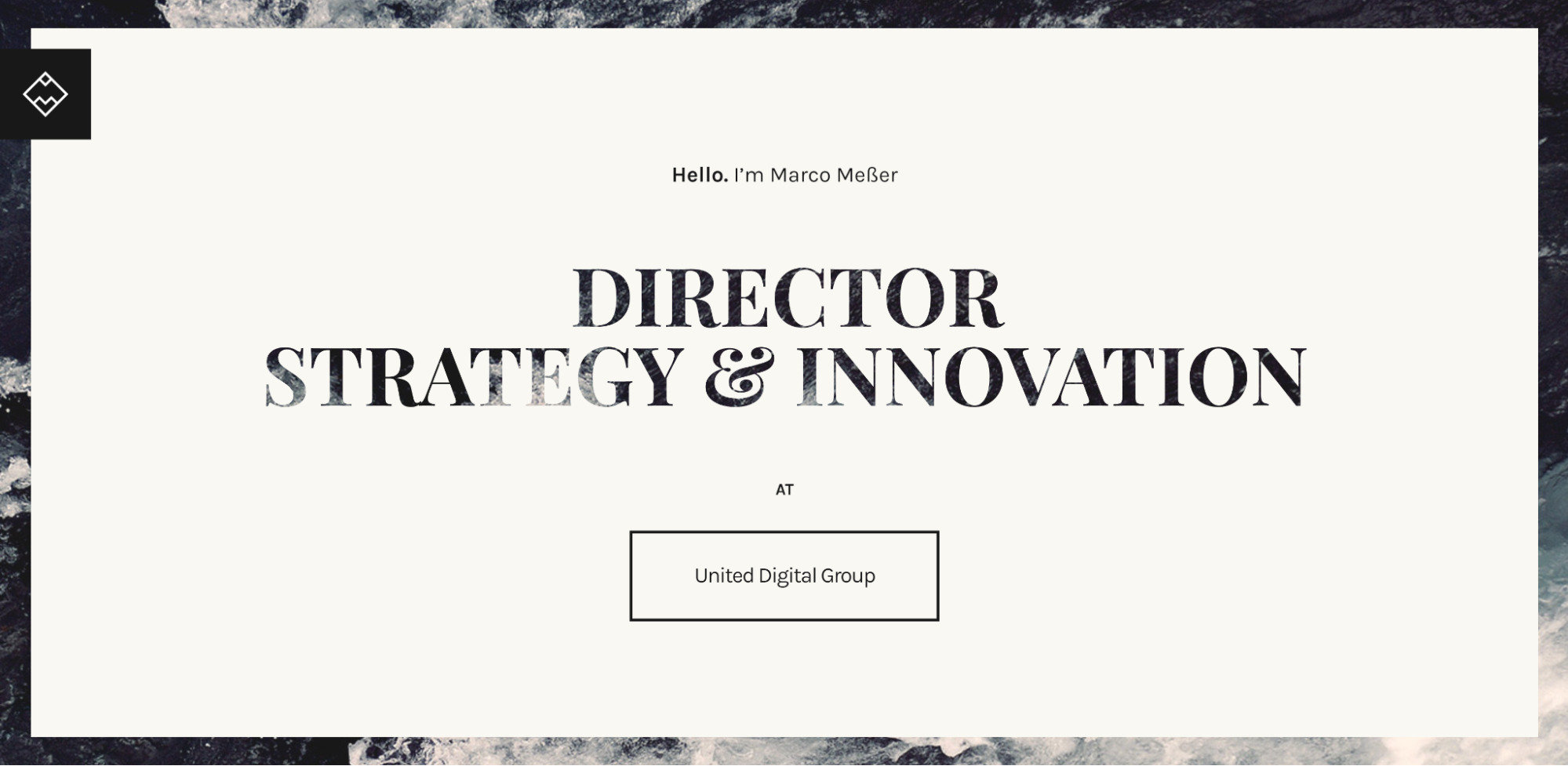
When the cursor is over the off-white button, it turns black and an animated arrow points in the direction of where you should click. You are prompted to click on the link by the elegant, understated, and incredibly effective contrasting color and animation.
This Stu-designed pop-out button’s hover interaction is ideal for revealing and concealing non-essential content on a page. The inactive buttons have an orange and blue color, but when you hover over them, they both turn green. Green is a welcoming and upbeat color that indicates you are making progress with your online activities.

The button not only turns green, but it also has two tiny pop-ups at the top and bottom. The “BUY FRUIT” button expands to say “A few more clicks sends Vlad a banana,” and the “DOWNLOAD” button expands to say “Click to download Sergi’s style guide: 1.4 MB.” These extra elements provide the visitor with more information and encourage them to continue reading. Even though these are not real people or downloadable materials, you will still find them amusing.
This understated, yet powerful button from Digital Bake’s website is one of the most well-liked ones because of its surprising hover effect. The “SEE MORE” button, which is red and has a right-facing arrow, is inactive. But when you touch it, an arrow becomes animated and a rectangular button with rounded corners comes to life.

Bright red is the default color on a crisp white canvas, but because of its simplicity, it can be used on any website. There are countless applications for this button; just modify the text and colors to match your website and call to action.
Instead of requiring users to manually scroll all the way to the top of the page, a scroll-to-top button automatically returns them there. With a single click, they can go back to the top of the page and select a different menu or navigation bar.
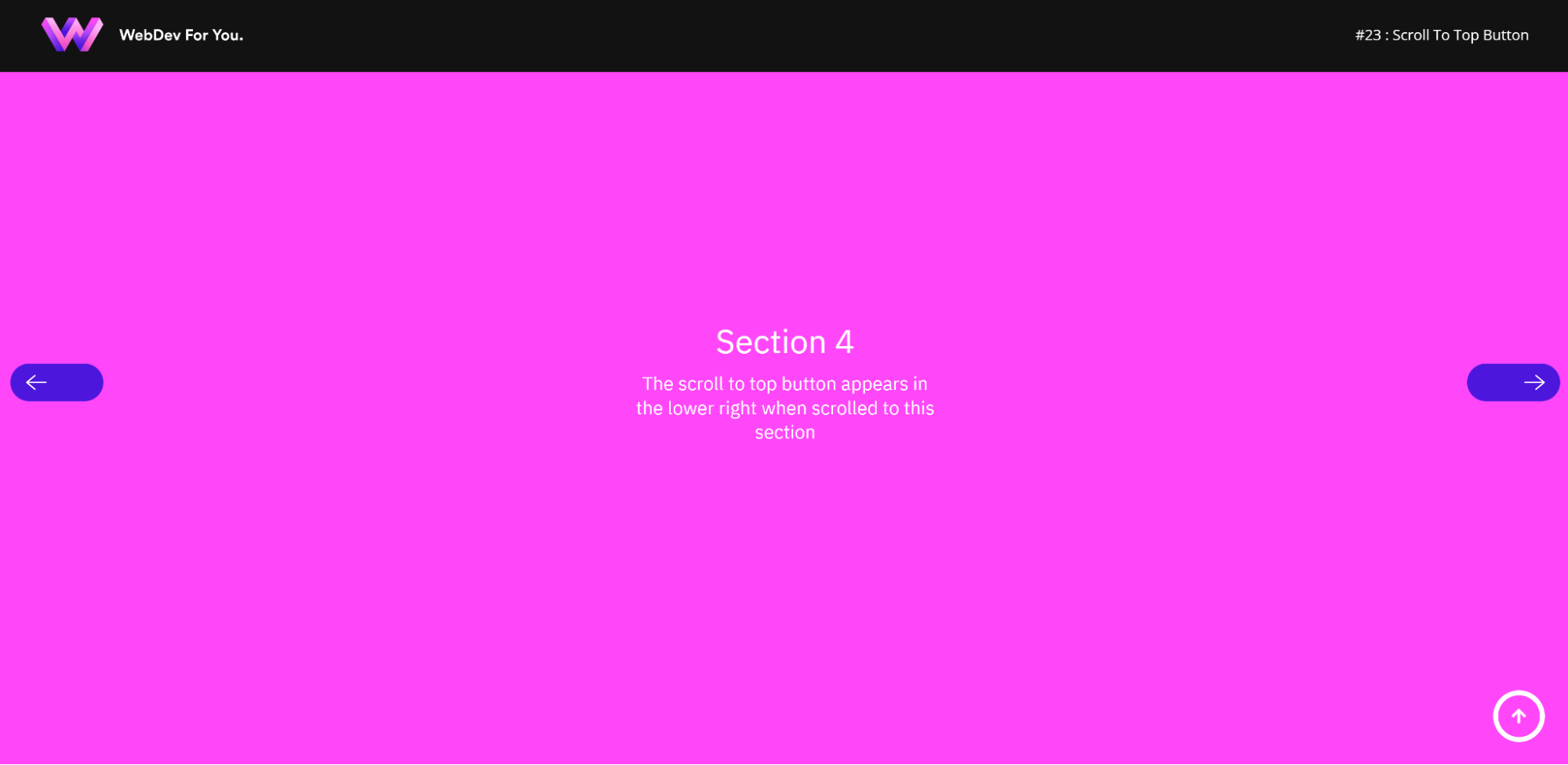
You can return to the homepage of the website by clicking this button. Back-to-top buttons come in especially useful for those who use smartphones and for lengthy pages, such as product lists or blog articles. Longer pages to scroll through are typically the result of websites and mobile apps being optimized and compressed for phones. A back-to-top button could really change things.
In today’s digital world, user experience is the king of the castle, and buttons are its loyal knights. But who wants bland, rusty knights guarding their website? ONextStudio’s UI/UX design expertise can help you craft trendy buttons that are as visually delightful as a perfectly presented donburi bowl. These buttons won’t just look good – they’ll be intuitive to use, strategically placed, and ultimately drive conversions for your website or app. Think of them as user experience powerhouses, guiding users with clarity and encouraging them to take action. Let’s ditch the click fatigue and design buttons that are worthy of a standing ovation! Contact us today.
Topic started 2 years
Last Post 2 years ago