
Logo Design
Creative Interior Design Logos: How to Make Your Brand Stand Out?
Topic started 2 years
Last Post 2 years ago
October 25

Finding the perfect color scheme can make or break your project. The right combination of hues can elevate your design, grabbing attention and setting the mood. But where do you find those ideal pairings? Look no further than the world of aesthetic color codes! These curated palettes go beyond basic color pickers, offering unique and inspiring combinations that can take your design to the next level. Ready to ditch the bland and embrace the beautiful? Let’s dive into 11 websites brimming with aesthetic color codes!
Sure, basic color pickers can get you started, but aesthetic color codes offer a whole new level of design magic. These pre-defined palettes aren’t just random color combinations. They’re carefully crafted to evoke specific emotions and create a certain atmosphere. Think of them as pre-mixed color cocktails, bursting with flavor (or should we say, visual impact) for your design project.
By utilizing aesthetic color codes, you can:
Unleash your inner designer and elevate your projects with these incredible websites! Each offers a treasure trove of aesthetic color codes, waiting to spark your creativity.
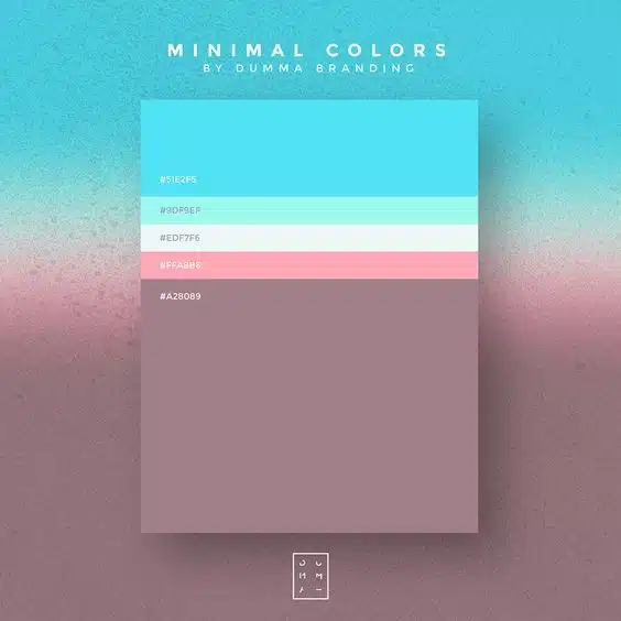
Dive into the calming oasis of “Soft Beach.” This palette embraces serene blues like #51e2f5 and #9df9ef, accented with a touch of #ffa8b6 pink sand and grounded by a #edf756 dusty white. It’s perfect for websites or apps promoting relaxation and tranquility.
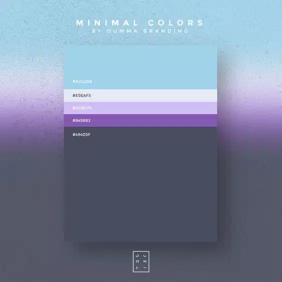
Feeling nostalgic? This palette takes you back with a cool and mysterious vibe. Think #a0d2eb ice cold paired with a touch of #e5eaf5 freeze purple and deeper shades like #d0bdf4 medium purple and #a28089 heavy purple. Ideal for designs aiming for a retro or vintage feel.
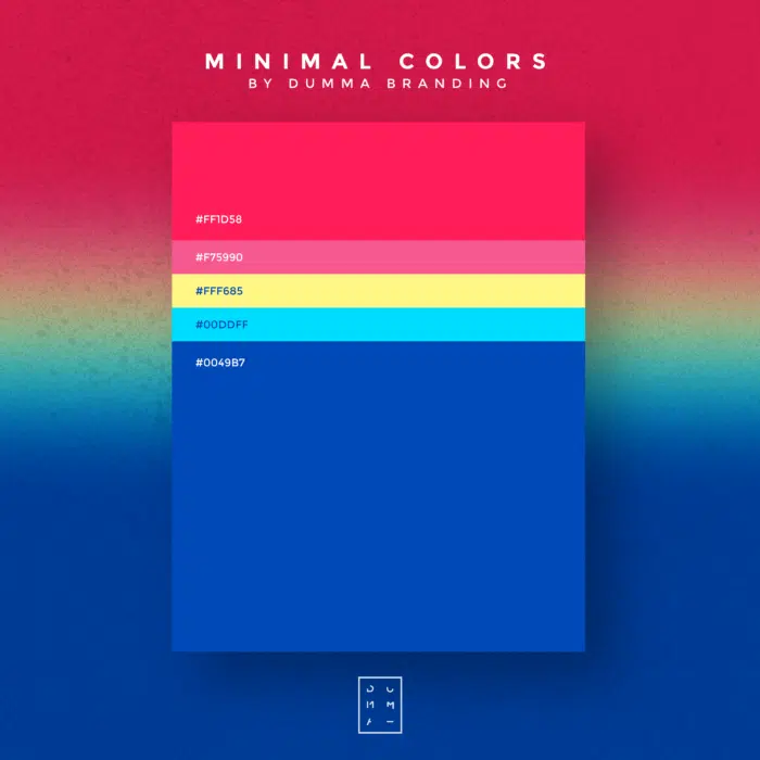
Channel your inner rockstar with this bold and energetic palette. It’s a color explosion featuring vibrant pinks like #ff1d58 Yass Queen and #f75990 Sister Sister, complemented by a sunny #fff685 Crown Yellow and contrasted with cool blues like #00DDFF Blue Light and #0049B7 Brutal Blue. Perfect for websites or apps oozing energy and excitement.
Reimagine your design approach with this modern twist. Sajon’s palette features a striking #ff1e00 bright orange, balanced by a calming #e8f9fd dimly blue, and a pop of #59ce8f alert/highlight green. This combination is ideal for grabbing attention and creating a fresh, contemporary feel.
Inspire hope and action with Cuberto’s palette designed for global charities. It features a warm and inviting #f43a09 brightly orange number two, contrasted with a calming #c2edda grey blue green, and a touch of lively #68d388 live green. This combination evokes feelings of trust, compassion, and positive change.
Build trust and professionalism with Juliene Renvoy’s palette for banking and finance websites. Subtle pinks like #fbe3e8 pinky and #ebf6f5 teeny greeny, along with a calming #5cbdb9 blue green create a sense of security and reliability.
Make a bold statement with this daring combination. It features a vibrant #beef00 bright green, an electric #ff0028 red, and a deep #657a00 green for a powerful and eye-catching effect. This palette is perfect for projects demanding attention and a strong visual impact.
Embrace a touch of elegance with this unnamed palette. It features a #fceed1 background tan, a rich #7d3cff purple-y, a sunshine yellow #f2d53c, and a bold #c80e13 redhead accent. This combination offers a sophisticated and versatile base for various design projects.
Create a sense of tranquility and peace with this unnamed palette. It features a sandy #e1b382 tan base paired with a deep and calming #2d545e night blue. This combination evokes feelings of relaxation and is perfect for websites or apps promoting wellness or spa services.
Inject a touch of fun and whimsy with this unnamed palette. It features a warm #fff5d7 ragin beige, a playful #ff5e6c coral pink, a mustard yellow #feb300 sleuthe yellow, and a soft #ffaaab pink leaf accent. This combination is ideal for designs targeting a younger audience or aiming for a lighthearted and energetic feel.
Bring your illustrations to life with this whimsical unnamed palette. It features a grassy #9bc400 green, a majestic #8076a3 purple mountains majesty, and a soft #f9c5bd misty mountain pink with a touch of #7c677f factory stone purple. This combination is perfect for children’s illustrations, fantasy artwork, or any project aiming for a magical and enchanting aesthetic.
With a world of aesthetic color codes at your fingertips, the excitement can quickly turn overwhelming. But fear not! Here’s how to navigate this vibrant sea of color and find the perfect palette for your project:
Remember, the best aesthetic color code isn’t just about aesthetics; it’s about aligning with your project’s goals and creating a powerful user experience. So, dive in, explore, and unleash the magic of color in your next design project!
Unveiled the ideal color code, but it feels like a lone masterpiece in a cluttered gallery? OnextStudio’s design ninjas are here to curate a cohesive brand experience! We’ll weave your chosen color palette through web design, branding, and marketing materials, creating a symphony of visual harmony that captivates your audience. Imagine your website bursting with the energy of your chosen palette, seamlessly echoed in your logo and marketing materials. Let OnextStudio be your design conductor, orchestrating a brand experience that resonates from the first note to the final flourish. Contact us today.
Topic started 2 years
Last Post 2 years ago