

Logo Design
Creative Interior Design Logos: How to Make Your Brand Stand Out?
Topic started 2 years
Last Post 2 years ago
October 25


In the realm of branding, simplicity often reigns supreme. When it comes to college logos, the same principle holds true. In this comprehensive guide, we delve into the essence of simplicity and unveil the top 10 best simple college logos in 2024. From the psychology behind simplicity to the impact of color choices, we explore every aspect of these iconic symbols.
A simple college logo serves as a visual symbol adopted by academic institutions to facilitate public identification. Usually, it comprises uncomplicated shapes like a wordmark, icon, or logo, often accompanied by a motto that encapsulates the institution’s ethos.
Typically minimalist in design, it prioritizes fundamental elements over intricate details, ensuring easy recognition and remembrance. Such logos may employ monochromatic or restrained color schemes and legible typography to effectively convey the institution’s message.

Simple college logos offer numerous advantages:
1. Ease of Recognition: Simplified logos are instantly identifiable, making them easily remembered and recognized by the public.
2. Emotional Impact: Minimalist designs can evoke immediate emotional responses, as they are processed more swiftly by the brain.
3. Enhanced Memorability: In a landscape inundated with logos, uncomplicated designs stand out and are more likely to be retained.
4. Timeless Appeal: Simple logos tend to endure and remain effective over time, circumventing the need for frequent redesigns.
5. Aesthetic Attraction: Visually pleasing logos foster positive associations with the brand, with simpler designs often being the most aesthetically pleasing.
6. Brand Differentiation: They aid in establishing a unique brand identity, setting the institution apart in the marketplace.
7. Credibility Boost: Simple logos serve as symbols of credibility, underscoring the institution’s dedication to quality education and academic distinction.
These factors collectively contribute to a robust brand presence and can influence perceptions of the institution’s professionalism, academic prowess, and community engagement.
The emblem of Harvard University serves as a quintessential illustration of a straightforward yet impactful college logo. It comprises a shield bearing the Latin word “Veritas,” translating to “Truth,” positioned atop three open books. This design eloquently mirrors Harvard’s steadfast dedication to education and the pursuit of truth.
![]()
The logo’s simplicity is evident in its restrained color palette and absence of intricate embellishments, rendering it easily distinguishable and unforgettable. Employed by the university for over a century, it embodies Harvard’s enduring tradition of excellence.
The University of Texas at Austin’s logo is a clear example of a straightforward yet powerful emblem for colleges. It shows a modern shield taken from the university’s seal, representing its academic roots and values. Notably, the shield has 18 leaves, each for one of the university’s colleges and schools.
The word “Texas” stands out in big letters, showing strength and tradition, and is accompanied by the full university name and shield for context. They chose the GT Sectra font, a modern serif typeface, for its easy reading and academic feel.
![]()
They stick to strict brand rules to keep the logo clear, consistent, and the same across all platforms. In color, the word “Texas” should be in burnt orange, or black or gray if burnt orange isn’t possible. Also, it can be white on burnt orange, black, or gray backgrounds.
With its simplicity and loyalty to brand rules, this logo stands as a strong symbol of the University of Texas at Austin’s high status as a top public research institution.
The University of North Carolina at Chapel Hill’s logo shows how simple college logos can be. It’s the main symbol of the university’s look and is used a lot to help people recognize it. The logo is simple and easy to understand, so it stands out and connects with different kinds of people.
![]()
There are two versions of the logo: one that’s wide and one that’s tall. They both need enough empty space around them to look right and make a strong impression. It’s very important to use the logo’s original digital artwork without changing it. This keeps things consistent and makes sure people remember the brand.
The logo comes in only three colors: Carolina Blue, black, and white. These colors match the university’s official colors and make the logo look good. The UNC logo’s simplicity, clear letters, and smart use of color show what the university is all about.
The Ohio University emblem stands as a widely recognized representation of the institution’s rich legacy and distinct identity. Its primary iteration, featuring the university’s name in a crisp, serif font, serves as the predominant logo treatment. This straightforward approach ensures adaptability and readability across a spectrum of contexts.
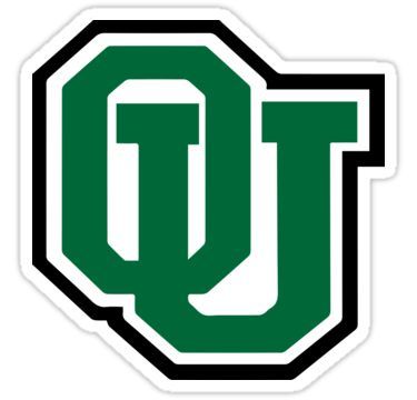
Incorporated within the formal logo is a distinctive emblem termed the “woodcut,” showcasing iconic campus structures: Cutler, Wilson, and McGuffey halls, alongside the wordmark. However, it’s essential to note that the woodcut should always accompany the wordmark, with the standalone wordmark emerging as the favored logo treatment for most Ohio University communications and marketing efforts.
Purposeful in its simplicity, the logo maintains a uniform and polished aesthetic, facilitating easy recognition. It adheres meticulously to the university’s branding directives, governing its usage, color scheme, and designated clear space parameters, thus safeguarding the logo’s integrity and visual impact. The Ohio University logo stands as a testament to the potency of minimalist design in cultivating a enduring institutional brand identity.
The University of Oregon’s logo is a masterclass in simplicity and brand identity. The most iconic element is the “O” mark, which is both a letter and a symbol, encapsulating the essence of the university in a single character. This “O” is not just a letter from the alphabet but a representation of unity, inclusion, and the circular nature of education and community at the university.

The logo is versatile and has been designed to work across various media, from print to digital platforms. It’s a logo that can stand alone without any additional elements and still be immediately associated with the University of Oregon. The color scheme typically involves the university’s official colors, which are green and yellow, reflecting the natural landscapes of Oregon and the university’s vibrant spirit.
The simplicity of the design ensures that it is timeless and not subject to the whims of design trends. It remains clear and recognizable whether it’s on a small mobile screen or emblazoned across a stadium. This logo is a testament to the power of minimalist design in creating a lasting and impactful brand identity.
![]()
The university also uses an academic mark, which is a more formal representation of its identity. This mark includes a shield that contains images representing key elements of Notre Dame’s values, traditions, and aspirations. The academic mark is used on official communications and embodies the university’s academic and Catholic traditions.
Both the monogram and the academic mark are designed to be clear and recognizable at various sizes and across different mediums. They abide by the branding protocols of the university, guaranteeing a uniform and polished presentation that cultivates instant recognition and affiliation with the University of Notre Dame.
The University of Miami’s emblem, recognized as the “split-U mark,” stands as a distinctive and widely acknowledged symbol. This simple yet impactful design features the letter ‘U’ divided into two parts, symbolizing the university’s ethos and character. Integral to the university’s visual identity system, this logo is prominently employed across various communication channels to signify the institution’s excellence and solidarity.
![]()
Beyond being a mere emblem, the split-U mark embodies the university’s dedication to innovation and leadership in education. It serves as a visual representation that unifies the diverse community of students, faculty, staff, and alumni. Stringent guidelines govern the logo’s design to ensure consistent usage and uphold the university’s image.
Ultimately, the University of Miami’s logo encapsulates the institution’s core values and aspirations, serving as a beacon of its academic and cultural influence, both locally and globally.
The logo of Clemson University is a source of pride and a testament to tradition, showcasing the renowned Tiger Paw alongside the wordmark “CLEMSON.”
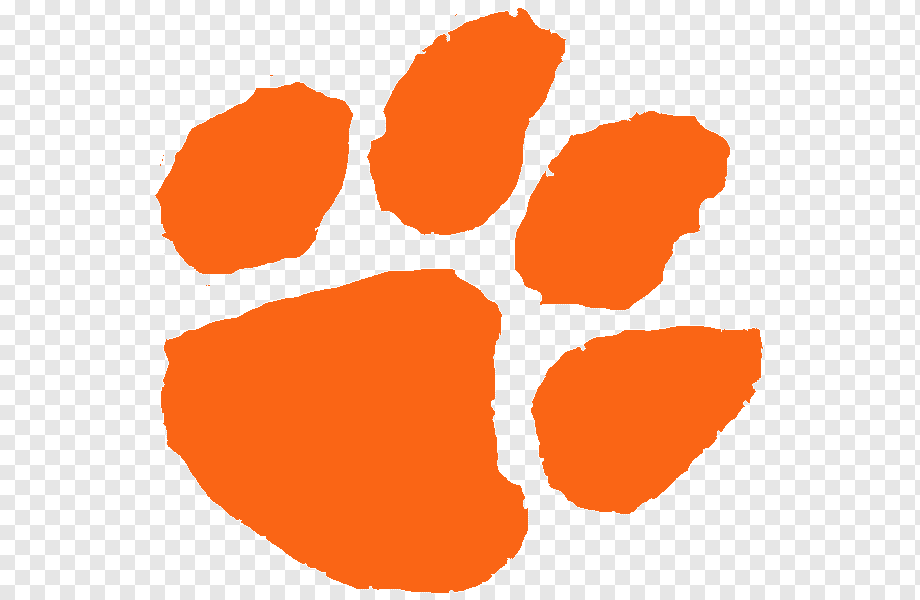
The Tiger Paw symbolizes the university’s spirited determination and athletic prowess, while the wordmark, often presented in vibrant Clemson Orange, signifies its commitment to academic excellence and community solidarity. This straightforward yet compelling logo serves as the universal identifier for all facets of Clemson, spanning from athletics to academics, and embodies the institution’s enduring values and rich heritage.
The Bowdoin College logo is a reflection of the institution’s esteemed history and academic eminence. At its core lies the Bowdoin wordmark, a distinctive typographic rendition of the college’s name that holds trademark status and serves as the principal visual identifier. Additionally, the college boasts a range of branding elements, including the Polar Bear mascot, which embodies qualities of confidence, courage, intelligence, and dignity.
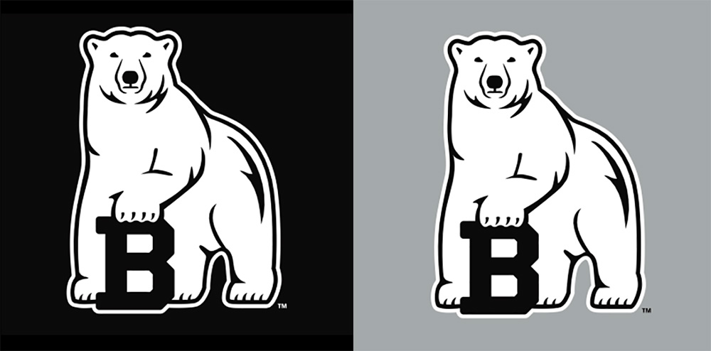
The Polar Bear is depicted in various iterations, such as a full-body representation, a medallion, and a paw print, each governed by specific usage guidelines to uphold the college’s visual identity. These logos and symbols transcend mere imagery; they encapsulate Bowdoin’s values and form an integral part of the community’s ethos and pride.
The University of Hawai’i’s emblem is a simple yet resonant design that embodies the institution’s identity and heritage. Typically showcasing the official seal or signature, it incorporates elements representing Hawai’i’s unique environment. Governed by stringent graphic standards, the logo is meticulously utilized across diverse media to uphold the university’s brand integrity.
![]()
The choice of colors and fonts is deliberate, aligning with the university’s official colors and ensuring clear and concise messaging. In essence, the University of Hawai’i’s logo serves as a visual ambassador of the institution’s commitment to educational excellence and its profound cultural connection to Hawai’i.
In conclusion, the power of simple college logos cannot be overstated. Through clean design, strategic use of color, and clear typography, these logos effortlessly convey the essence of their respective institutions. If you need help with web design, branding, marketing design, or app design, you can contact ONextStudio, a professional and creative web development agency. Contact us now for more information.
Topic started 2 years
Last Post 2 years ago