June 30
Building a strong brand starts with a logo, whether you’re launching a personal project or a new business. Think of some iconic brands you know well. Can you visualize their logos alongside their names? (Think Apple, Nike, or that red and white beverage company!) Square logos are a powerful option, offering a unique aesthetic that can leave a lasting impression.
A logo, like a memorable image or catchy slogan, serves as the cornerstone of a powerful brand identity. Without a logo that leaves a lasting impression, it becomes difficult for potential customers to recognize or remember your brand. Still on the fence? The shape of your logo, seemingly a simple design choice, can significantly impact how your brand is perceived, according to research. So, let’s explore how a well-designed square logo can elevate your brand and make a lasting impression.
Square logos are everywhere – from the iconic Gap logo to the familiar BBC emblem. But before you jump on the bandwagon, consider the message you’re conveying.
The power of a square logo lies in its simplicity. It evokes a sense of stability, balance, and professionalism. A well-designed square logo can instantly build trust with your audience. After all, many things we associate with security, like safes and sturdy buildings, have a strong, square form. By choosing a square logo, you’re subconsciously communicating reliability and a commitment to quality.
Ready to craft your own eye-catching logo? Square shapes offer a fantastic canvas for impactful designs! Whether you’re building a photography portfolio or aiming to stand out on marketplaces like Etsy, a well-designed square logo can be a powerful marketing tool.
Here are some inspiring square logo concepts to get your creative juices flowing:
Imagine your logo as a mini-billboard for your brand! Squares are excellent for conveying your brand identity at a glance. After all, your logo is the first impression potential customers have. Use this space to showcase what your business offers.
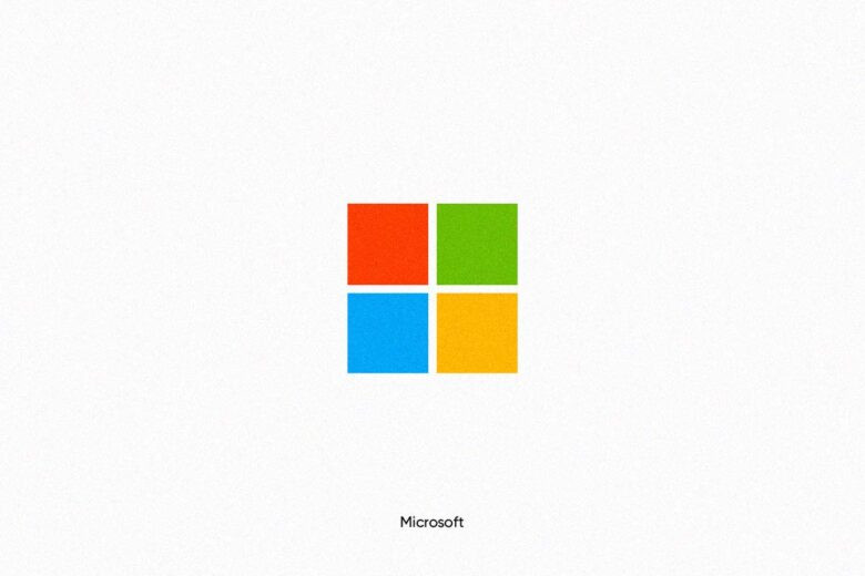
For example, consider the Microsoft logo. It features four colorful squares, each symbolizing a different product category. This clean and balanced design conveys a lot of information in a simple way.
Another great storytelling example is Instagram. Their logo, a rounded-edge orange square with a camera outline, instantly communicates their core function: sharing photos.
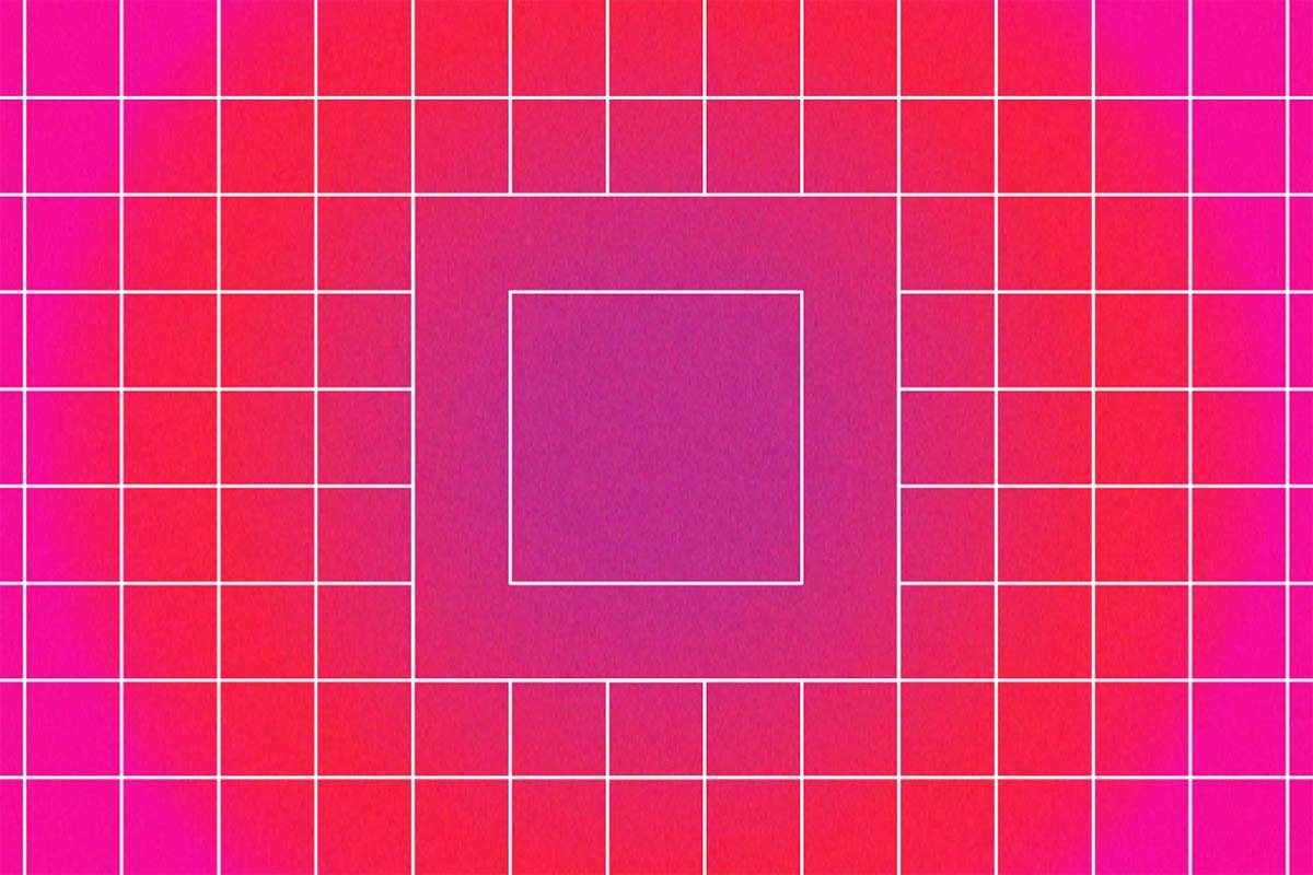
![]()
Squares offer a perfect canvas for minimalist logos. By removing unnecessary details and loud colors, you can create a design that’s both impactful and clean.
This approach is ideal for brands targeting audiences who value simplicity. Think baby products for new parents, luxury brands with a minimalist aesthetic, or even user-friendly tech products. A simple logo can effectively highlight your brand’s core values and resonate with your target market.
Take Gap’s logo for instance. It achieves maximum impact without visual clutter, using a navy blue background and a serif font to convey tradition and a laid-back shopping experience.
Square logos excel at making your brand appear professional and trustworthy. By experimenting with design elements within the square format, you can craft a structured design that leaves a strong impression.
Think about the logo of a well-established law firm. It likely conveys a sense of stability and reliability – qualities clients seek in legal counsel. A square logo design with clean lines and a formal typeface can achieve this effortlessly.
Squares used in logo design can also evoke a sense of strength and resilience. After all, squares are fundamental building blocks, forming the foundation of everything from sturdy architecture to secure safes.
However, incorporating some curved elements alongside the squares can create a more balanced and approachable feel. Take, for example, the logo of a prominent sports apparel brand. It might combine powerful squares with dynamic curves, symbolizing both strength and flexibility – perfect for athletic wear.
Not all square logos prioritize structure and stability. Some businesses use squares to break convention, showcasing their innovative spirit. This approach signifies to consumers that you’re a brand that thinks differently.
These logos are often eye-catching and memorable, leaving a lasting impression. They’re a fantastic way to visually communicate your brand’s unique personality. If your company is a disruptor in its field or offers something entirely new, consider a bold square logo design to tell your story in a fresh way.
Your logo is the first impression your brand makes, so it should perfectly capture your essence. Here’s how to craft a dazzling and well-proportioned square logo:
Square logos can be bold and modern, but they can also be inviting. Consider your brand personality. If you want to convey harmony, incorporate softer elements like curved lines or rounded fonts. Think of how Instagram uses a friendly, rounded typeface alongside a clean square icon.
Don’t feel limited by a literal square outline. Experiment with layouts! Could your logo benefit from a box or frame? Perhaps incorporate smaller shapes within the design for added depth. Many brands subtly evoke the square concept through elements like geometric shapes, straight lines, or boxy fonts. Take a look at Spotify’s logo – it uses a subtle square shape with rounded corners and a dynamic color gradient.
If your company name is lengthy, consider creating a memorable symbol or monogram to use in place of the full name. Simple and concise logos are easier to remember. Think about how Apple’s logo instantly conveys the brand without needing any text.
Don’t be afraid to play with color, shapes, and other design elements to make your square logo stand out. Bold colors and unexpected shapes can grab attention and tell your brand story. Remember, a square logo doesn’t have to be square – it just needs to be remarkable!
Ready to bring your square logo concept to life? ONextStudio offers expert Branding services to craft a logo that perfectly reflects your brand identity. Our design team will collaborate with you to develop a logo that’s both stunning and strategically designed to resonate with your target audience. Contact us today.