
Logo Design
Creative Interior Design Logos: How to Make Your Brand Stand Out?
Topic started 2 years
Last Post 2 years ago
October 25

The right logo is like a handshake for your brand – it makes a lasting first impression. But what happens when that first impression needs a refresh? In this post, we explore 10 logo redesigns that transformed brands, proving that sometimes, an update is the key to unlocking true brand potential. Let’s dive in and see what makes these redesigns so inspiring!
While these examples showcase the final, stunning results, a successful logo redesign involves a thoughtful process. Here’s a glimpse into the key stages that bring these inspiring transformations to life:
The journey begins with a deep dive into the brand itself. Designers work closely with clients to understand their brand goals, target audience, and core values. This introspective phase helps define the essence the logo needs to capture.
Understanding the landscape is crucial. Designers analyze logos of competitors and industry leaders to identify trends, avoid visual overlap, and ensure the new logo stands out within its competitive space.
This is where creativity takes center stage! Designers explore various visual directions through sketching, mood boards, and initial logo drafts. This stage might involve exploring different color palettes, typographic styles, and symbolic elements to find the perfect fit.
The most promising concepts are then refined and iterated upon. This stage involves meticulous adjustments to ensure the logo is clear, balanced, and visually appealing across various applications. Feedback loops between designers and clients are crucial here to ensure everyone is on the same page.
A great logo needs to work everywhere – from websites and business cards to billboards and social media avatars. Designers ensure the final logo is adaptable to different sizes and mediums without losing its impact.
This comprehensive process allows designers to translate the brand’s essence into a powerful visual symbol, ultimately leading to the inspiring logo transformations we see in these examples.
The inspiring logo redesigns we’ve explored demonstrate the transformative power of this process. But the benefits go beyond aesthetics. Here’s how a successful logo redesign can elevate your brand:
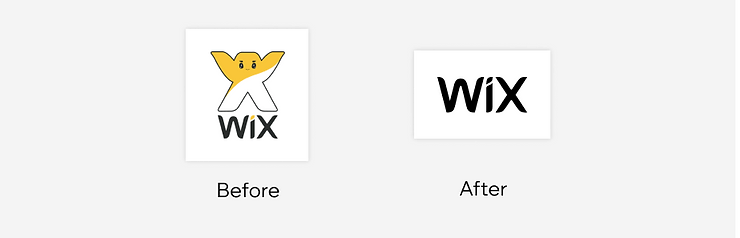
Wix, the website creation platform, understood that a logo needed to reflect not just their brand name but also their core value proposition. Their redesign went from a busy, text-heavy logo with the company name spelled out to a clean, minimalist symbol. The new design uses a subtle “W” shape within a vibrant blue square, cleverly referencing both their brand name and their focus on user-friendly creation tools. This shift to a more iconographic approach allows for better brand recognition at smaller sizes and across various digital platforms.
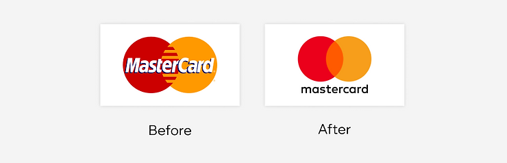
Mastercard’s redesign proves that sometimes, less is truly more. Their iconic interlocking circles, a symbol of connection and trust since 1966, got a subtle but impactful update. The overlapping circles are now more streamlined and the color palette is slightly refined, creating a more modern and sophisticated feel. This evolution ensures the logo remains timeless and easily recognizable in the ever-changing financial landscape.
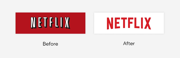
The streaming giant, Netflix, transitioned from a logo that relied heavily on gradients and a somewhat dated typeface to a sleek, flat design. The original “N” logo, while recognizable, felt confined to the limitations of print media. The new logo is more versatile across various applications and screen sizes, reflecting Netflix’s global reach and focus on digital content delivery. This shift to a flatter design aligns with the overall trend towards minimalism in modern logo design.
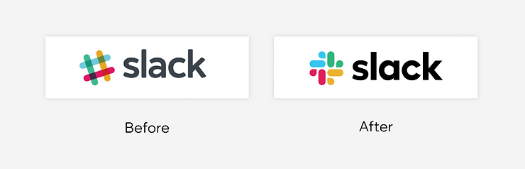
The popular communication platform, Slack, embraced simplification with their logo redesign. The original logo featured a more detailed illustration of a hashtag symbol, which could appear cluttered at smaller sizes. The redesign simplified the design to a clean, four-line hashtag, making it more modern and adaptable for various uses on digital platforms and mobile devices. This change also ensures the logo retains its core function of representing the hashtag symbol, a key element in Slack’s communication-focused brand identity.
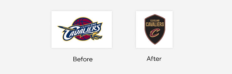
The NBA team’s Cleveland Cavaliers took a bolder approach to their logo redesign. They moved from a cartoonish design featuring a smiling horse and rider to a more fierce and stylized depiction of a knight on horseback. The new logo reflects a more aggressive and competitive brand identity, better aligning with the intensity of the sport. This dramatic shift aimed to portray the Cavaliers as a stronger contender on the court.

Taco Bell understood that sometimes, a logo refresh can be about refining what’s already there. Their logo redesign embraced a more minimalist approach. They simplified the iconic bell shape and removed unnecessary details, resulting in a cleaner and more modern design that retains its strong brand recognition. This streamlined design ensures the logo translates well across various packaging materials and marketing materials.
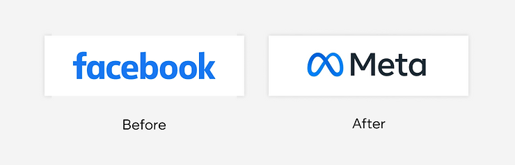
This social media giant’s rebrand involved a whole new name and logo. Facebook’s transition to Meta marked a significant shift in their focus, venturing into the realm of the metaverse. The new symbol, an infinity loop, represents connection and the vast potential of this virtual world concept that Meta is heavily invested in. This move away from the classic “f” symbol completely revamped their brand image, signifying a new era for the company.
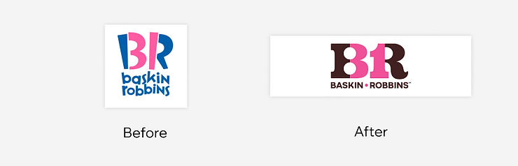
The iconic ice cream brand, Baskin-Robbins, recognized the importance of maintaining brand elements that resonate with their audience while implementing a refresh. Their logo redesign kept the familiar pink spoon element but revamped the surrounding design. The new logo features a bolder typeface and a more playful arrangement of the brand name, reflecting their fun and vibrant brand personality. This update ensures the logo remains recognizable to their loyal customer base while incorporating a more modern design aesthetic.

This photo-sharing platform, Instagram, transitioned from a logo that mimicked a real-life camera to a more abstract and minimalist design. The original skeuomorphic camera icon, while easily understood, felt dated as design trends moved towards flatter aesthetics. The new logo retains the essence of a camera but with a cleaner and more modern aesthetic. This shift reflects the platform’s evolution from a photo-sharing app to a more comprehensive social media platform.
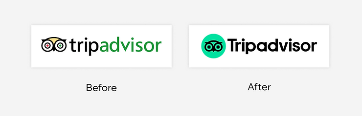
The travel review platform, TripAdvisor, opted for a more literal approach in their logo redesign. The original logo featured an owl symbol, which some users found unmemorable. The redesign opted for a simpler globe icon with a checkmark, representing exploration and user-generated reviews, the core of their business.
Topic started 2 years
Last Post 2 years ago