
Logo Design
Creative Interior Design Logos: How to Make Your Brand Stand Out?
Topic started 2 years
Last Post 2 years ago
October 25


In the age of user experience (UX) prioritization, website design choices hold significant weight. Among these choices, the debate between light mode and dark mode has become a prominent one. Both interfaces offer distinct advantages and cater to different user preferences. This article delves into the key considerations of light mode, exploring its impact on usability, accessibility, and overall user experience to help you decide which mode best suits your website.

Light mode represents the traditional aesthetic of web design. It features a light-colored background, typically white or a light shade of gray, with text and other UI elements displayed in a contrasting dark color, often black or dark gray. This high-contrast design prioritizes readability and evokes the familiar look of physical documents like books and printed materials. It is also generally considered more visually appealing for content-heavy websites, as it allows images and graphics to appear more vibrant and true-to-life against the light backdrop.
Light mode, characterized by a light background with dark text, reflects the traditional web design aesthetic. It boasts several advantages:
These factors contribute to a user experience that prioritizes clarity, visual richness, and user familiarity.
Accessibility is paramount in website design. Light mode generally adheres better to accessibility guidelines set forth by organizations like the World Wide Web Consortium (W3C). Here’s why:
However, it’s crucial to note that effective light mode implementation requires proper color selection. Using overly bright white backgrounds or low-contrast text colors can still hinder readability.
Pro Tip: Employ online contrast checkers to ensure your light mode color scheme meets WCAG standards.
By prioritizing accessibility, light mode fosters an inclusive user experience that caters to a wider audience.
While dark mode has gained significant traction in recent years, light mode retains its relevance. Here’s how it aligns with modern design trends:
Light mode’s adherence to these trends contributes to a website that feels modern, user-friendly, and focused on delivering a clear and concise message.
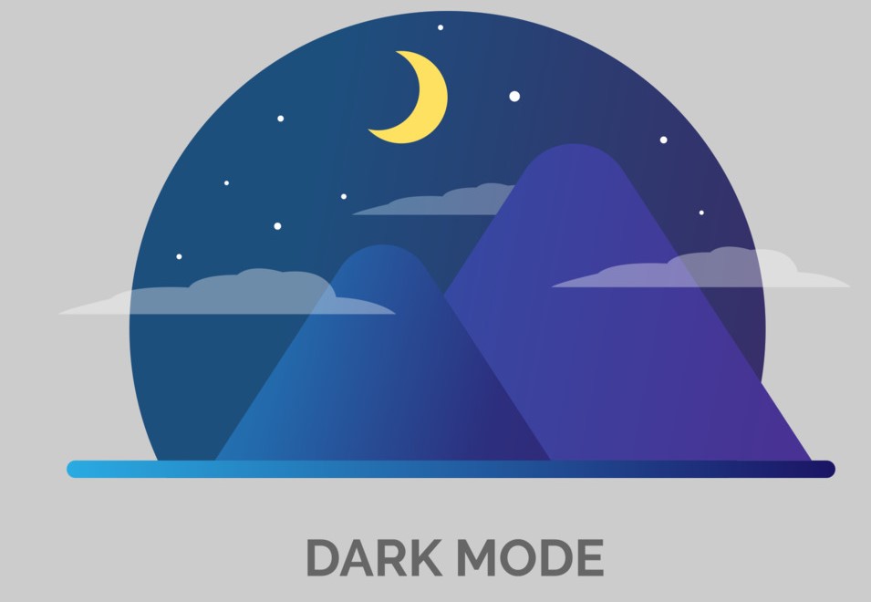
Dark mode, also sometimes referred to as night mode, offers a reversed color scheme compared to light mode. In dark mode, the background adopts a dark color, often black or a deep gray, while text and UI elements switch to a lighter color, such as white or light gray. Proponents of dark mode favor its ability to reduce eye strain in low-light environments, and some research suggests it may contribute to better sleep patterns by reducing blue light exposure. Additionally, dark mode can create a more modern and sophisticated aesthetic for certain websites.
Beyond aesthetics, dark mode offers several practical advantages:
Despite its benefits, dark mode isn’t without drawbacks:
Considering these limitations, it’s crucial to ensure proper implementation of dark mode if you choose to include it. Utilizing high-contrast color combinations, offering the ability to adjust text size, and thoroughly testing the user experience in dark mode are all essential steps.
Ultimately, the choice between light mode and dark mode hinges on your website’s specific goals and target audience. It excels in prioritizing readability, accessibility, and adherence to modern design trends. However, dark style offers advantages in low-light environments and caters to user preferences for a more modern aesthetic. The ideal solution might even involve offering users the ability to toggle between light and dark modes, granting them greater control over their browsing experience.
Is your website stuck in the light or the dark ages? ONextStudio can help you illuminate the path to a modern design that’s both user-friendly and visually captivating. We don’t just design websites, we craft experiences. Contact us today.
Topic started 2 years
Last Post 2 years ago