Creative Interior Design Logos: How to Make Your Brand Stand Out?
Topic started 1 year
Last Post 1 year ago
An application icon is one of the first things that users see when they browse an app store or launch an app. It is also a crucial element of your brand identity and user experience. Therefore, designing an application icon that is attractive, memorable, and distinctive is essential for your app’s success. In this article, we will share some tips and best practices on how to design an application icon that stands out from the crowd.
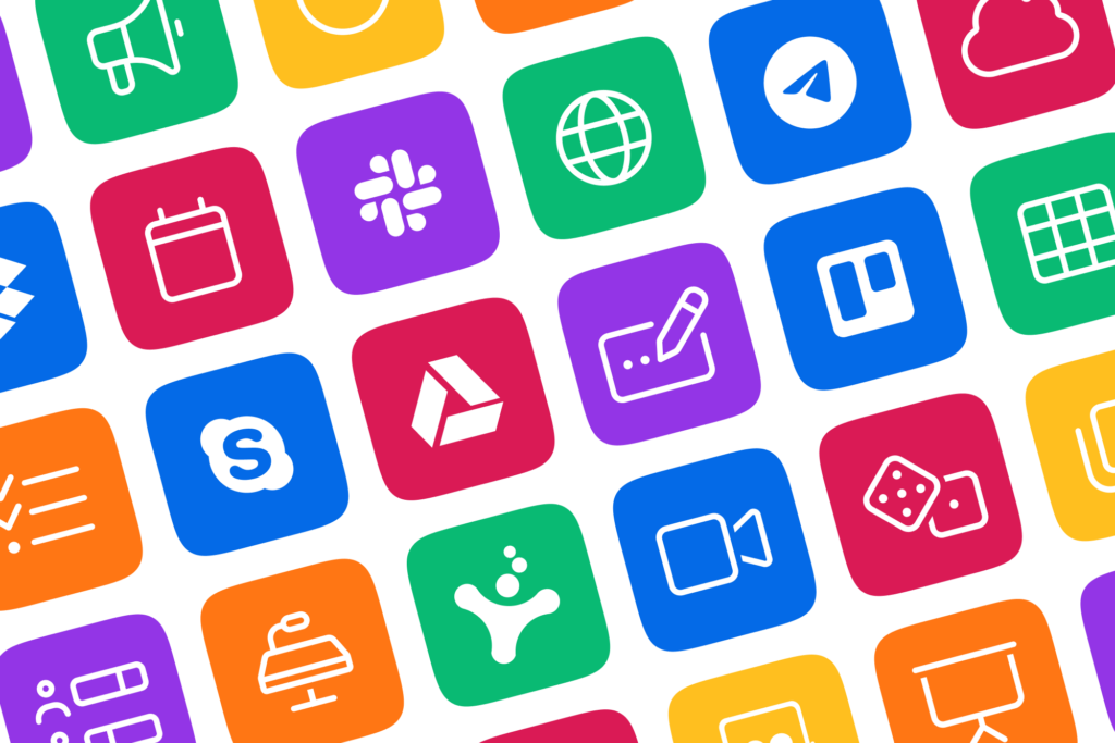
An app icon is a picture that shows an app on your device, like a phone or tablet. You can see it on the app store, settings, and search bar. It helps you find and use the app quickly. Also, it tells you what the app does and what it looks like. A good icon is simple, clear, attractive, and matches the app’s style.

An app icon is a picture that shows your app on a phone or in the app store. Having a good icon is important because it can:
– Make people remember your app and get more users
– Help people recognize your brand
– Show what using your app will feel like
– Make your app stand out from others and get seen more
– Tell people what your app does.
Before you start designing your application icon, you need to understand who your target audience is and what they expect from your app. You also need to research your competitors and see what kind of icons they use and how they differentiate themselves from others. This will help you avoid copying or blending in with existing icons and create an icon that appeals to your specific niche and market. You can use tools like App Annie or Sensor Tower to analyze the app store trends and user feedback.
Some questions to ask yourself are:

The shape of your application icon is the most important factor that determines its recognition and recall. You want to choose a shape that is simple, meaningful, and relevant to your app’s core function and theme. A simple shape is easier to identify and remember, especially on smaller screens and lower resolutions. A meaningful shape is one that conveys the essence and personality of your app and resonates with your target audience. A relevant shape is one that fits your app’s category and genre and avoids confusion with other icons.
Some tips to choose a simple and meaningful shape are:
The color scheme of your application icon is another key factor that influences its attractiveness and memorability. You want to select a color scheme that is harmonious, eye-catching, and consistent with your app’s brand identity and user interface. A harmonious color scheme is one that uses colors that complement each other and create a pleasing visual effect. An eye-catching color scheme is one that uses colors that stand out from the crowd and draw attention to your app. A consistent color scheme is one that matches your app’s logo, typography, and overall design.
Some tips to select a harmonious and eye-catching color scheme are:
The effect of your application icon is the final touch that adds some flair and polish to your icon. You want to add a subtle and appropriate effect that enhances your icon’s appearance and quality. A subtle effect is one that is not too flashy or distracting, but rather adds some texture, shadow, or gradient to your icon. An appropriate effect is one that matches your icon’s style and theme and does not clash with your app’s design.
Some tips to add a subtle and appropriate effect are:
Designing an application icon that stands out from the crowd is not an easy task, but it is definitely worth the effort. By following these tips and best practices, you can create an application icon that is simple, meaningful, harmonious, eye-catching, and subtle. An application icon that reflects your app’s purpose, value, and personality. An application icon that attracts, engages, and retains your users.
If you need more help with designing your application icon, you can contact ONextStudio, a professional web and app design company that offers high-quality and affordable services. We can help you with branding, marketing design, app design, and more. We can help you create an application icon that stands out from the crowd and makes your app shine. Contact us now to get free consultation.