
Logo Design
Creative Interior Design Logos: How to Make Your Brand Stand Out?
Topic started 1 year
Last Post 1 year ago
October 25

Ever scrolled down a search result, only to bounce away before the page even fully loaded? You’re not alone. In today’s fast-paced online world, attention spans are shorter than ever. Your website’s homepage has a critical window of just a few seconds to make a lasting impact. It’s the digital equivalent of a handshake – a chance to capture a visitor’s interest, communicate your brand’s essence, and ultimately, convert them from a curious browser into a loyal customer. This comprehensive guide will equip you with the tools to transform that initial click into a captivated audience. We’ll delve into the secrets of crafting a homepage design that not only grabs attention but compels visitors to dive deeper, turning fleeting first impressions into lasting connections and propelling your website towards success.
Wider Reach: The majority of web traffic now comes from mobile devices. A responsive homepage ensures your website is accessible to this vast audience, maximizing your reach and potential customer base.
Enhanced User Engagement: Responsive design doesn’t just ensure accessibility, it guarantees a comfortable and engaging experience for mobile users. With intuitive touch-friendly navigation, optimized images, and clear calls to action, visitors on the go can easily interact with your homepage and take the desired actions.
Improved Search Engine Optimization (SEO): Search engines like Google prioritize mobile-friendly websites in their search rankings. A responsive homepage not only caters to your audience but also boosts your website’s visibility online, attracting more organic traffic.
Increased Conversions: A frustrating mobile experience is a conversion killer. Responsive design removes this barrier, allowing mobile users to easily navigate your homepage and convert, whether it’s making a purchase, signing up for a newsletter, or contacting your business.
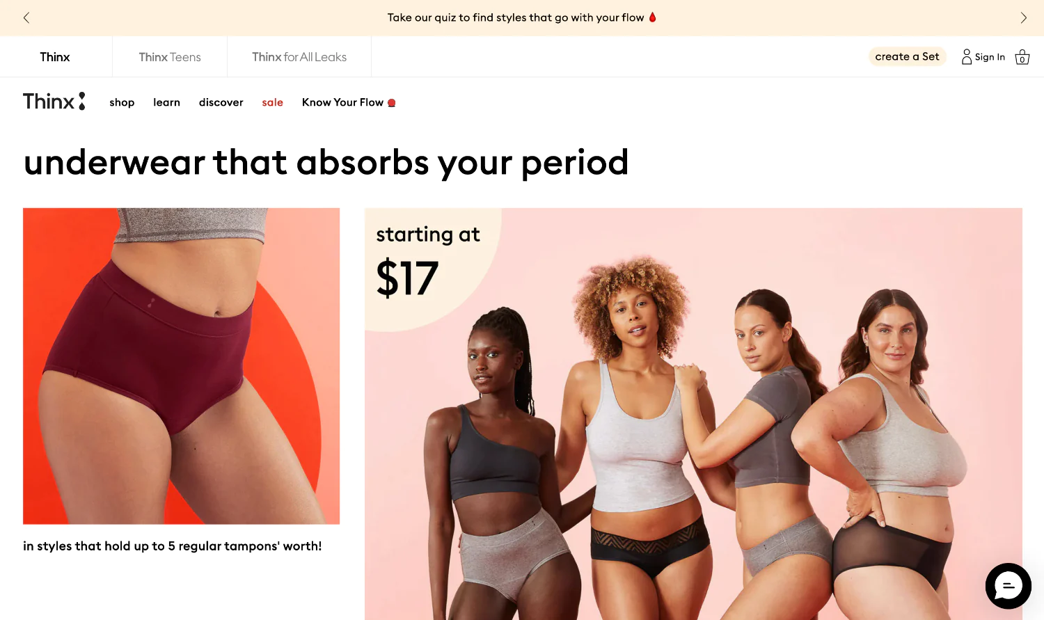
This period underwear brand utilizes a bold color scheme and relatable imagery to capture attention and communicate brand confidence. Their homepage design isn’t afraid to break the mold, breaking down taboos surrounding menstruation with a refreshing honesty. Thinx goes beyond simply showcasing products; their homepage champions female empowerment and inclusivity. Clear value propositions like “leakproof, period” and user-friendly navigation with clear product categories make it easy for visitors to explore solutions and find the perfect fit.
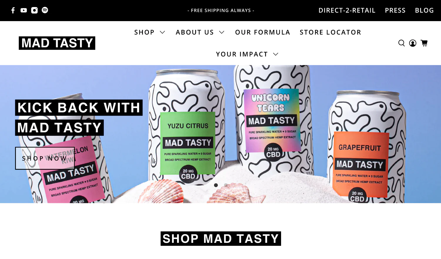
This sparkling water brand leverages a playful and vibrant homepage design to reflect their brand personality. High-quality product visuals featuring vibrant colors and playful bubbles entice visitors to learn more about their unique flavors. Engaging product descriptions with a touch of humor further pique curiosity and encourage exploration.
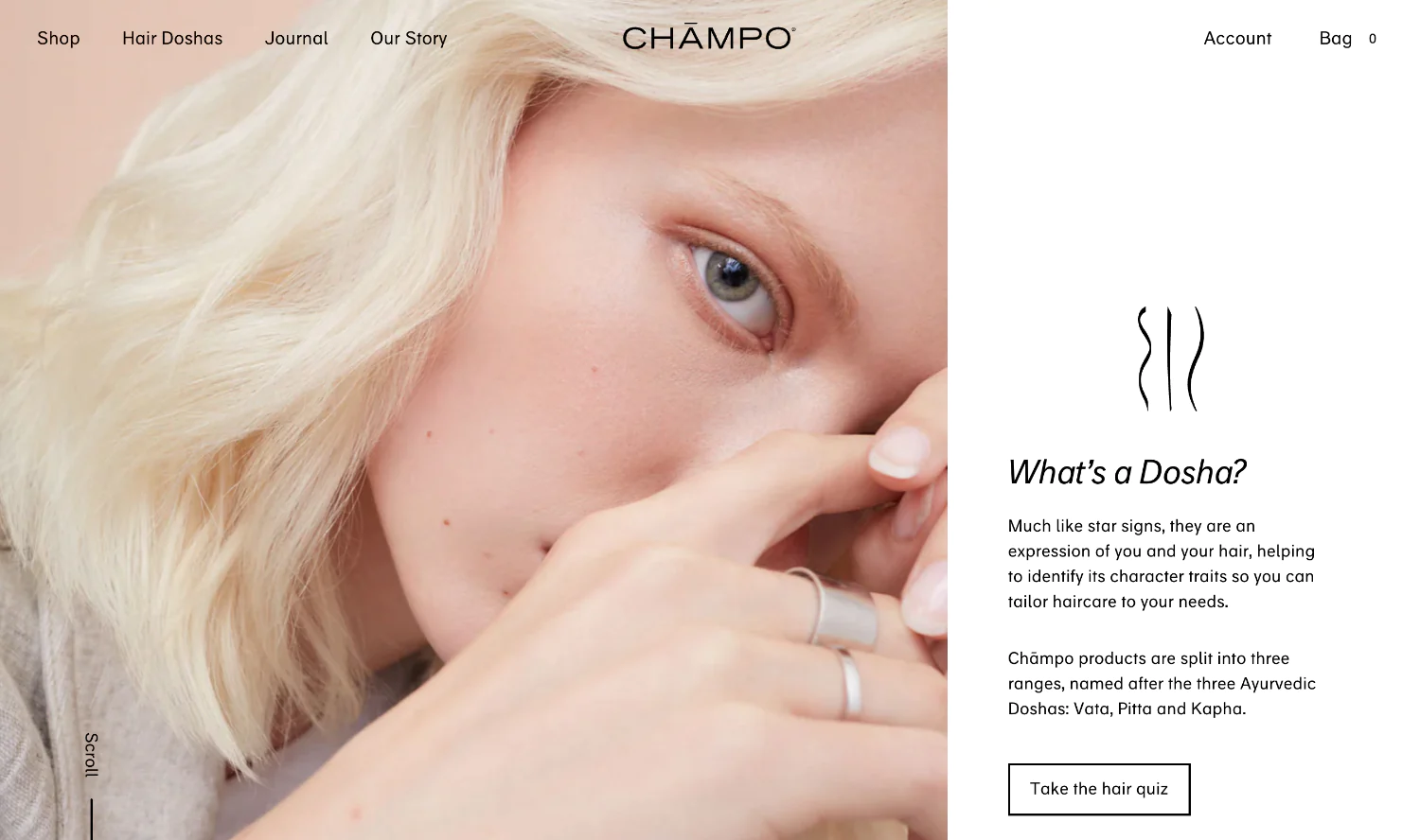
Drawing inspiration from Ayurveda, this haircare brand uses calming visuals and natural elements on their homepage. Earthy tones and images of botanical ingredients create a sense of serenity and align with their focus on natural, holistic haircare. Chämpo’s homepage goes beyond just aesthetics; it personalizes the experience by offering a hair quiz to recommend the perfect product routine for each visitor. Clear CTAs like “Start Your Hair Journey” encourage visitors to take action and discover their healthiest hair yet.
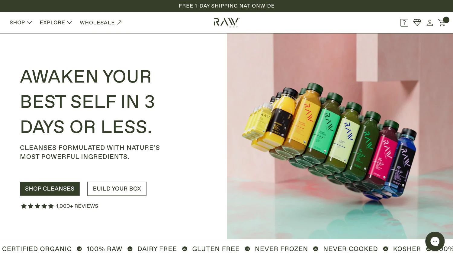
This juicery prioritizes fresh ingredients and clean living on their homepage. High-resolution photos of their cold-pressed juices and vibrant cleanses combined with concise text create a feeling of health and vitality. The design evokes a sense of freshness and purity, perfectly aligning with Raw’s commitment to using organic ingredients.
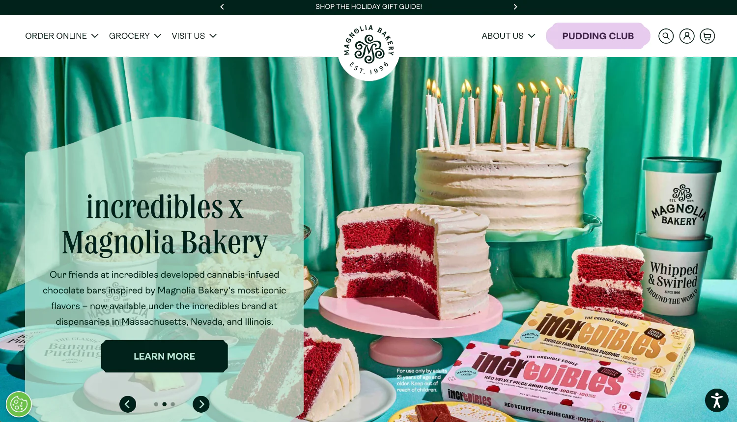
This iconic bakery utilizes a nostalgic vintage aesthetic on their homepage, transporting visitors to a classic bakery experience. Warm, inviting visuals of their mouthwatering cupcakes, pies, and cakes instantly trigger cravings. The design leverages the power of nostalgia, evoking memories of freshly baked goods and childhood treats. Magnolia Bakery keeps things user-friendly with clear ordering options, allowing customers to indulge in a taste of tradition with just a few clicks.
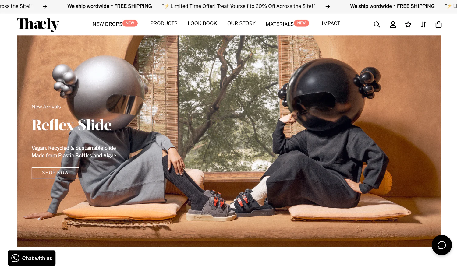
This could be a clothing brand or a fashion retailer. Their homepage design might showcase high-quality product photography featuring stylish models or trendsetting flatlays. The use of clean lines and a minimalist aesthetic could convey a sense of sophistication and modern fashion sense. Clear navigation with categories like “Dresses,” “Tops,” or “New Arrivals” would allow visitors to easily explore their collection.
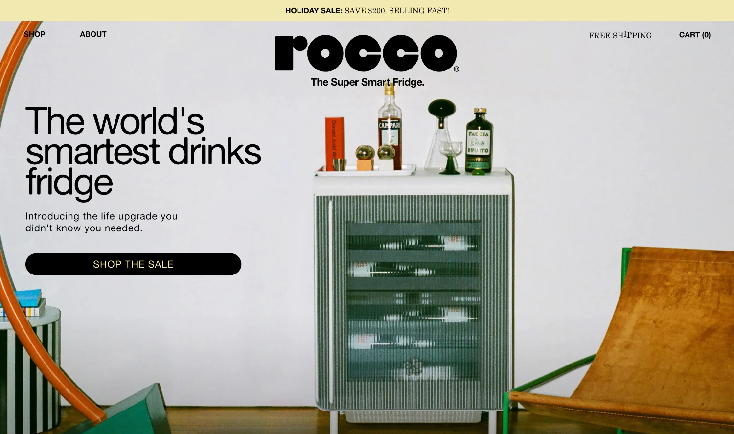
This could be a pet care brand or a pet service provider. Their homepage design might feature heartwarming visuals of playful pets or satisfied pet owners. The use of soft colors and calming imagery could create a sense of trust and care, aligning with their focus on pet well-being. Rocco’s homepage could utilize clear CTAs like “Shop Now” for pet supplies or “Book a Service” for grooming or dog walking.
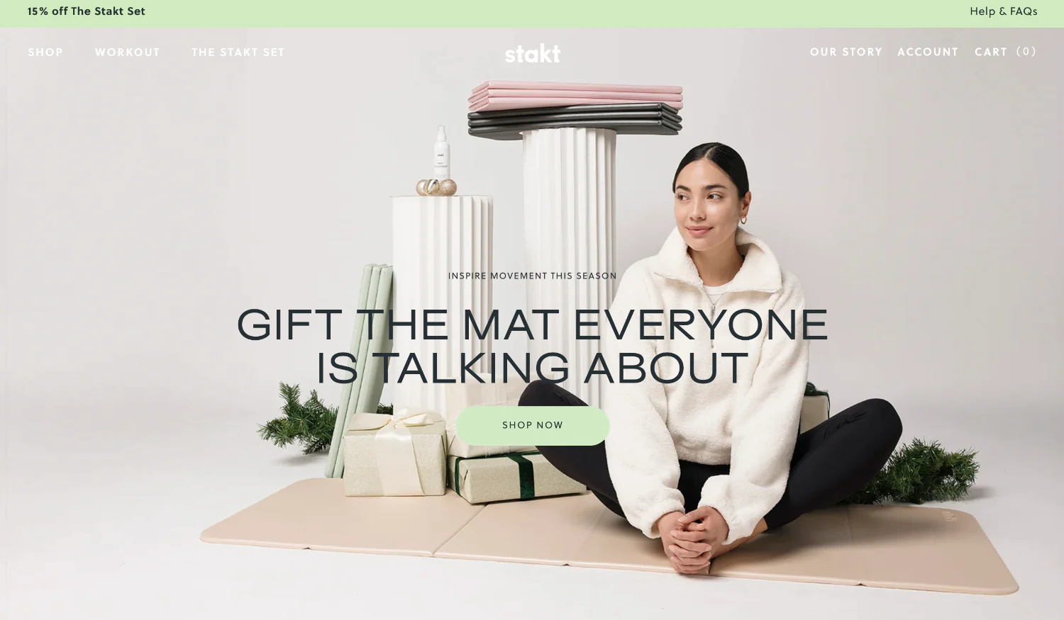
This could be a co-working space or a business solutions provider. Their homepage design might leverage professional imagery of collaborative workspaces or successful business people. The use of muted tones and clean lines could convey a sense of professionalism and productivity. Stakt’s homepage could highlight testimonials from satisfied clients or showcase the benefits of their co-working space with clear CTAs like “Learn More” or “Contact Us.”
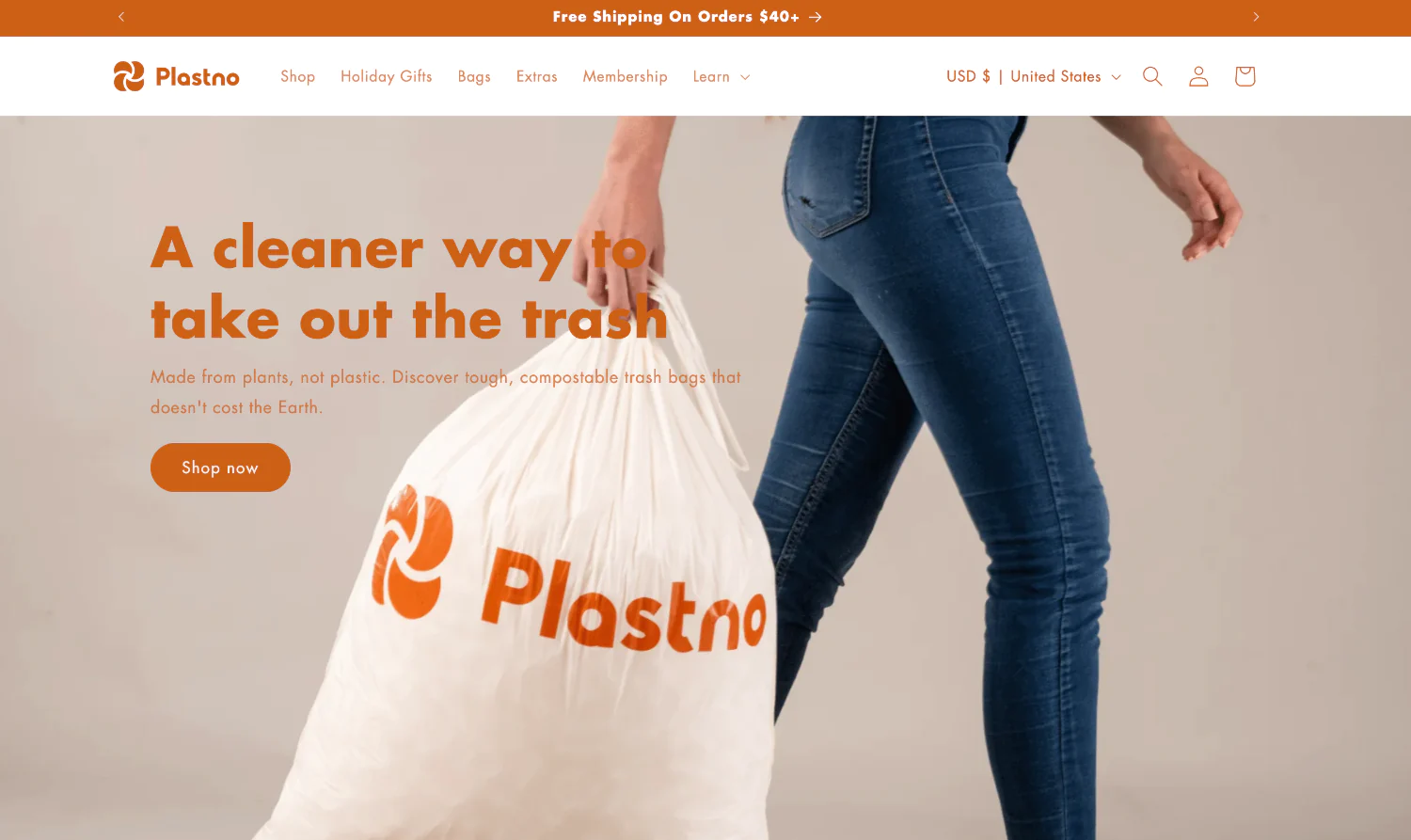
This could be a furniture brand or a home decor retailer. Their homepage design might feature high-resolution photos of their stylish furniture pieces or beautifully designed living spaces. The use of warm tones and inviting imagery could create a sense of comfort and inspiration. Plastno’s homepage could utilize clear category navigation for different furniture types (“Living Room,” “Bedroom”) or offer design inspiration with blog posts or curated collections.

This could be a social media platform or a beauty brand. Their homepage design might leverage user-generated content featuring happy customers or visually appealing product imagery. The use of bright colors and engaging visuals could create a sense of community and excitement. Lyka’s homepage could highlight the benefits of their platform for users or showcase their beauty products with clear CTAs like “Download Now” or “Shop the Collection.”
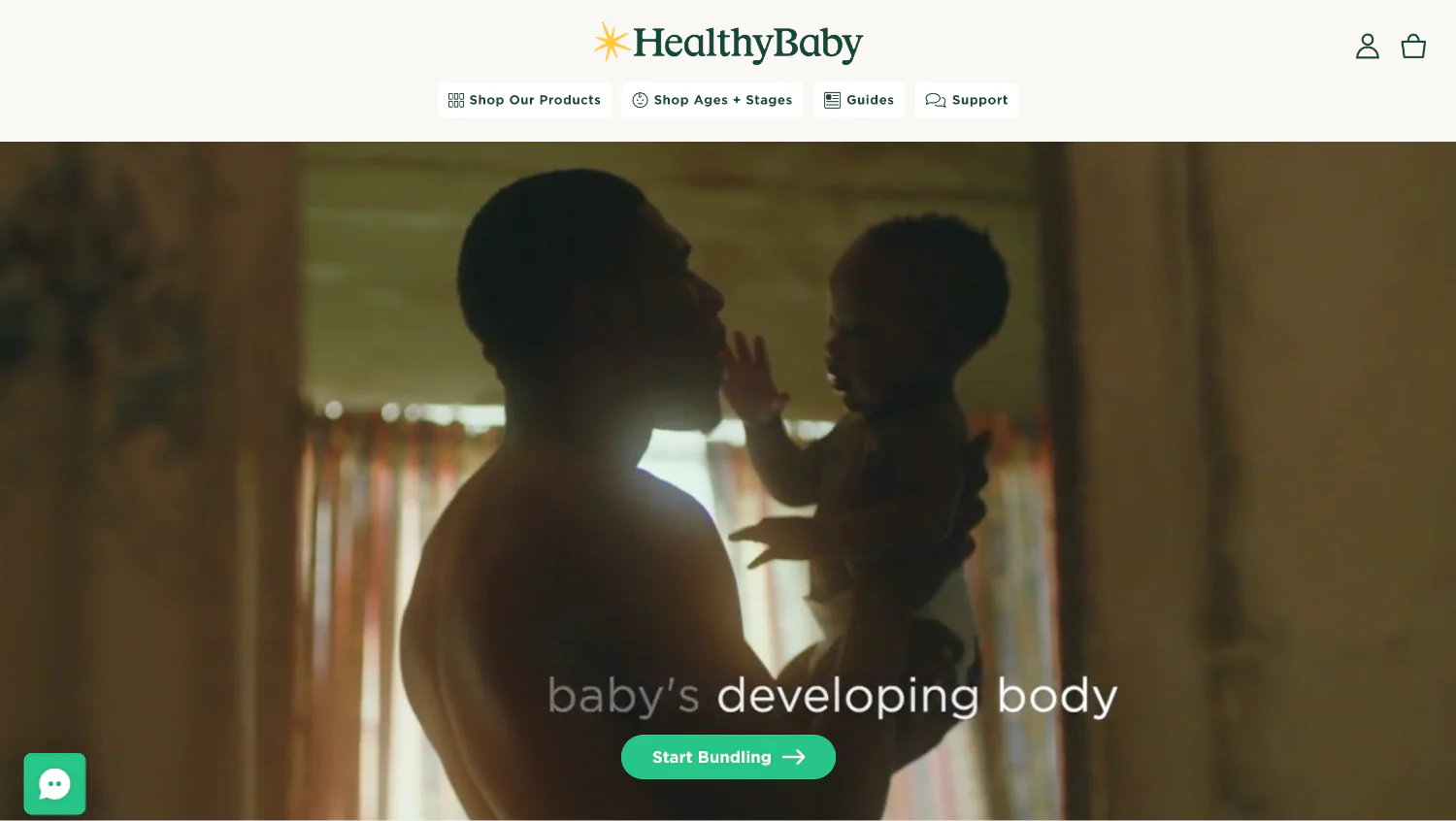
This could be a parenting resource website or a baby product retailer. Their homepage design might feature heartwarming photos of smiling babies or informative graphics about child development. The use of calming colors and gentle imagery could create a sense of trust and reassurance for new parents. HealthyBaby’s homepage could offer valuable parenting tips or highlight their curated selection of baby products with CTAs like “Read Our Blog” or “Shop Now for Baby.”
Imagine your homepage as a captivating pop-up shop in the hippest part of town, but accessible to everyone, everywhere. ONextStudio can design a homepage that stops visitors in their tracks, unfolds your brand story like a captivating narrative, and gets them hitting those CTAs with the same excitement as scoring a front-row seat to their favorite band. We don’t just design websites, we design immersive experiences that not only grab attention but strategically convert browsers into loyal customers. Let’s transform your homepage into the digital equivalent of a sold-out show, leaving visitors wanting more and ready to hit that “buy” button. Contact us today.
Topic started 1 year
Last Post 1 year ago