Creative Interior Design Logos: How to Make Your Brand Stand Out?
1. Why a Logo is Essential for Your Interior Design Business?
2. Key Elements of an Effective Interior Design Logos
3. Examples of Successful Interior Design Logos
4. Tips for Designing Your Own Interior Design Logos
5. How to Differentiate Your Logo in a Competitive Market?
6. Conclusion
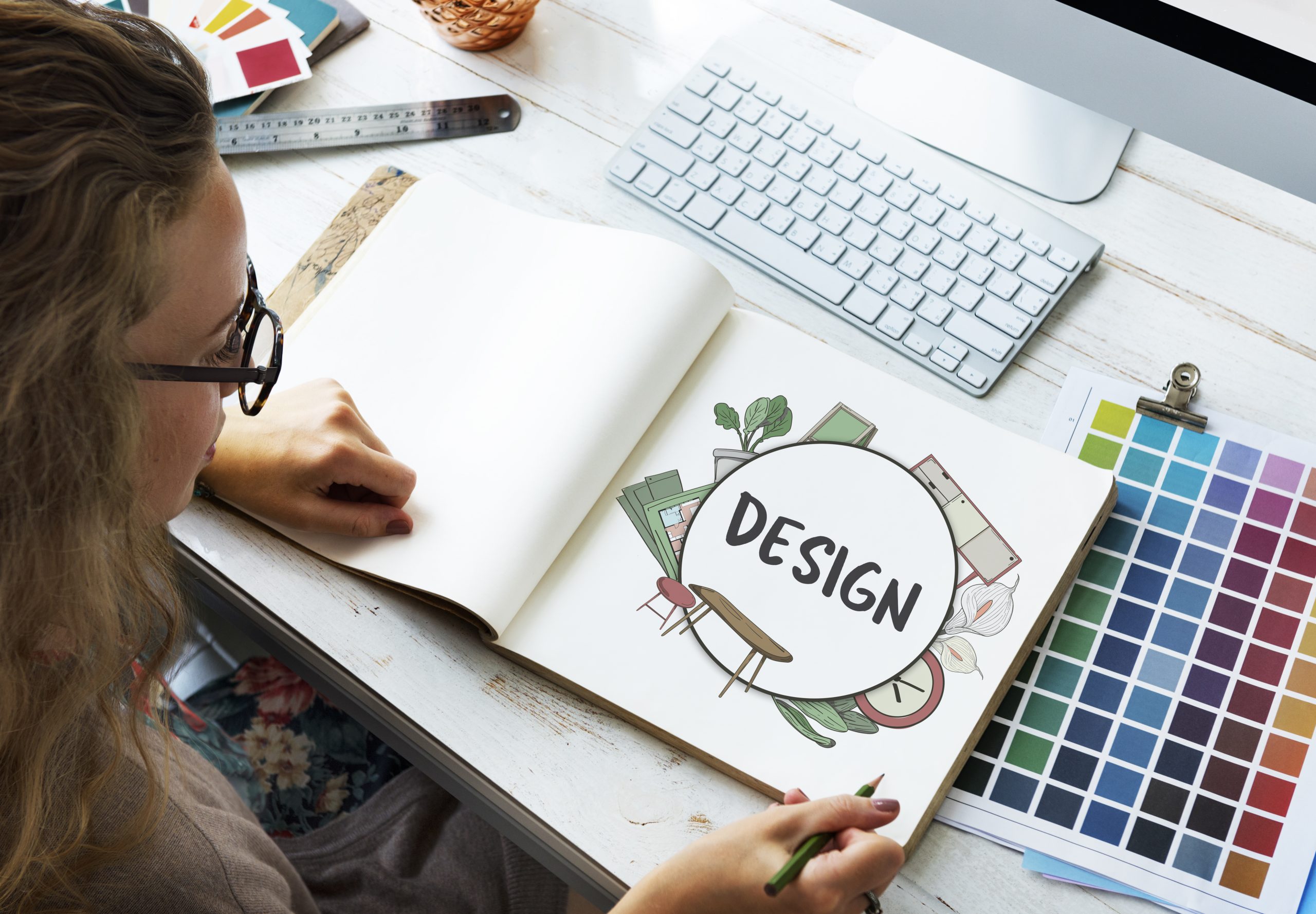
In the fiercely competitive world of interior design, a standout brand identity is essential for success, and interior design logos are at the heart of it all. A powerful logo doesn’t just capture attention; it reflects a designer’s unique style and artistic vision, becoming a visual ambassador of the company’s values, creativity, and expertise. With the right logo, an interior design business can make a lasting impact, attract the right clients, and communicate a sense of quality and professionalism that sets it apart in the industry.
1. Why a Logo is Essential for Your Interior Design Business?
A logo is much more than just a visual mark; it is the cornerstone of your brand identity. In the interior design industry, where aesthetics and creativity are key, a logo serves as the first impression your potential clients will have of your business. It communicates who you are and what you stand for at a glance, setting the tone for how clients perceive your services.
Establishing a strong brand identity is critical in such a visually driven field, and your logo plays a central role in that process. A thoughtfully designed logo can instantly convey your style, whether it’s modern, minimalist, or luxurious, helping to attract the right clients. It acts as a visual representation of your design philosophy, making your brand more memorable and easily recognizable in a crowded market.
Beyond just aesthetics, a logo also communicates professionalism, creativity, and trustworthiness. A clean, well-crafted logo signals that you take your business seriously and pay attention to detail—qualities that clients are looking for when hiring an interior designer. A creative, unique logo reflects your ability to think outside the box, assuring clients that you will bring fresh, innovative ideas to their projects. Most importantly, a consistent and professional logo builds trust. When clients see a cohesive brand, they are more likely to feel confident in your ability to deliver high-quality work, making a strong logo a vital tool for your interior design business.
2. Key Elements of an Effective Interior Design Logos
Creating an effective logo for an interior design business requires a balance of simplicity, meaning, and aesthetics. Each element of the logo should work together to convey your brand’s identity and appeal to your target audience.
2.1 Simplicity
A strong interior design logo should be clean, simple, and easy to recognize. In a visual industry like interior design, a cluttered logo can distract from your message. Simple logos are more memorable and versatile—they can be scaled across different mediums, from business cards to websites, without losing impact. A minimalist design also suggests clarity and focus, traits that clients value in an interior designer.
2.2 Color Scheme
Colors play a powerful role in evoking emotions and communicating your design style. The right color scheme can instantly convey the essence of your brand. For example, earthy tones like greens and browns may reflect a focus on sustainable or organic designs, while a monochromatic palette of black, white, or grays can highlight a modern, sleek aesthetic. Bright, bold colors could indicate creativity and a playful approach, whereas muted, soft tones could signal elegance and sophistication. Choosing the right colors is key to aligning your logo with your business’s design philosophy and making a lasting emotional connection with clients.
2.3 Typography
The font you choose can say a lot about your interior design business. Elegant script fonts are perfect for luxury designers, conveying sophistication and high-end appeal. On the other hand, modern sans-serif fonts are ideal for designers who embrace minimalism and contemporary styles. Typography should complement your brand’s personality and remain legible across all formats. Just like in design, balance is essential—too ornate, and the message might be lost; too simple, and the brand may feel underdeveloped.
2.4 Symbols & Imagery
Incorporating symbols and imagery into your logo can reinforce your brand’s message. Common symbols in interior design logos include house shapes, furniture icons, geometric patterns, and abstract lines. For example, a logo with a house shape might communicate that you specialize in residential design, while clean geometric patterns could suggest a modern, structured approach. Furniture icons or design elements like lamps or chairs may subtly hint at your expertise in creating functional and beautiful spaces. However, the key is to keep the imagery balanced—use just enough to enhance recognition without overwhelming the design.
3. Examples of Successful Interior Design Logos
To truly understand what makes an interior design logo effective, let’s look at some examples from well-known designers and firms. These logos not only stand out visually but also communicate a clear message about the brand’s style and target audience.
3.1. Rehab Nabil
Rehab Nabil’s logo reflects her expertise in creating luxurious and sophisticated interiors. The design features a sleek, modern serif font, with her name elegantly displayed. The typography often includes gold or metallic accents, enhancing the sense of opulence. This logo embodies her commitment to high-end, bespoke design, appealing to clients who seek elegance and sophistication in their spaces.
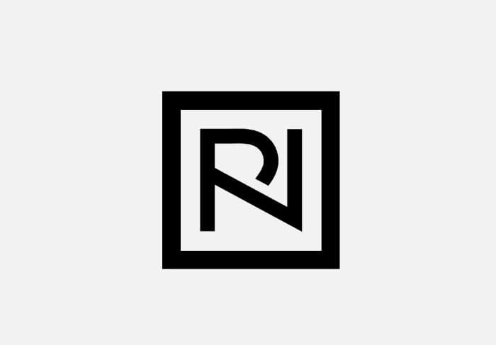
Why it works: The combination of elegant typography and luxe colors immediately conveys a sense of professionalism and high quality, making it attractive to a discerning clientele who values elegance and timeless design.
3.2. Alexandrea Rose
Alexandrea Rose’s logo captures her unique blend of contemporary and bohemian styles. It typically features a graceful, hand-lettered script for her name, paired with a modern sans-serif font for any accompanying text. This combination reflects her artistic flair while maintaining a sense of professionalism. The color palette often incorporates soft, earthy tones, aligning with her focus on natural, organic elements in her designs.
Why it works: The flowing script communicates creativity and warmth, while the clean sans-serif font adds balance and clarity. This logo effectively appeals to clients looking for a relaxed yet stylish interior that marries bohemian charm with modern sophistication.
3.3. Gray House
Gray House’s logo embodies contemporary sophistication with a sleek, all-uppercase serif font that exudes confidence and style. The clean lines and subtle spacing give the logo a balanced and modern appeal, while a warm, neutral color palette reflects the brand’s commitment to creating cozy, timeless interiors.
Why it works: The logo’s minimalist elegance mirrors Gray House’s design philosophy, which centers on crafting inviting, carefully curated spaces that feel both luxurious and accessible. This approach effectively communicates a sense of professionalism and quality, attracting clients who value understated beauty and thoughtful design.
3.4. Change Interior Design Studio
Change Interior Design Studio’s logo exemplifies a fresh and innovative approach, featuring modern sans-serif typography that conveys a sense of transformation and creativity. The design is characterized by dynamic lines and strategic spacing, creating a sense of movement and fluidity. A vibrant color palette is often employed, reflecting the studio’s focus on bold, contemporary designs that invigorate and energize spaces.

Why it works: The modern aesthetic aligns perfectly with Change Interior Design Studio’s philosophy of reimagining interiors to foster a sense of renewal and inspiration. This logo communicates a forward-thinking and adaptable mindset, appealing to clients who seek unique and imaginative design solutions that enhance their environments.
3.5 Golt Studio
Golt Studio’s logo showcases a bold and artistic vision, featuring a unique blend of contemporary sans-serif typography and distinctive geometric shapes. The clean lines and thoughtful arrangement create a striking visual identity, while a vibrant color palette conveys creativity and energy, reflecting the studio’s innovative approach to design.
Why it works: This logo encapsulates Golt Studio’s commitment to pushing boundaries and redefining spaces. Its modern aesthetic communicates a sense of originality and craftsmanship, attracting clients who are looking for fresh and imaginative design solutions that stand out in a crowded market.
4. Tips for Designing Your Own Interior Design Logos
Creating an effective logo for your interior design business is crucial for establishing a strong brand identity. Here are some tips to guide you in designing your logo, whether you choose to hire a professional or embark on the process yourself.
4.1 Hiring a Professional Designer vs. Using Online Design Tools
When it comes to logo design, you have two primary options: hiring a professional designer or using online design tools.
- Hiring a Professional Designer: If you have the budget, working with a professional designer can be immensely beneficial. A designer brings expertise in visual branding, understands design principles, and can tailor your logo to reflect your unique style and business values. They can also provide valuable insights into color theory, typography, and composition, ensuring that your logo stands out in a competitive market.
- Using Online Design Tools: For those on a tighter budget, online design platforms like Canva or Adobe Express offer user-friendly templates and tools for logo creation. While these tools provide flexibility and ease of use, they may lack the uniqueness and tailored approach of a professional designer. If you choose this route, make sure to customize templates to reflect your brand’s identity, rather than relying solely on pre-made designs.
4.2 Consider Your Target Audience
Understanding your target audience is essential when designing your logo. Consider the following questions:
What style appeals to them?
Your logo should resonate with your ideal clients. For example, if your target audience values modern minimalism, opt for clean lines and a simple color palette. Conversely, if your clients lean toward a more eclectic or bohemian style, consider incorporating playful typography or organic shapes.
Researching competitors in your niche can also provide insight into what works and what doesn’t, helping you differentiate your brand.
4.3 Think About Scalability
A good logo should maintain its integrity across various platforms and sizes. When designing your logo, consider how it will look on:
- Business Cards: Ensure that your logo is easily recognizable and legible, even at smaller sizes.
- Websites: The logo should fit seamlessly into your website design, maintaining its clarity and visual appeal.
- Social Media: Since social media profiles often display logos in circular or square formats, ensure that your design remains impactful in these settings.
Testing your logo in different formats and sizes during the design process can help you assess its scalability and overall effectiveness.
4.4 Avoid Trends That May Become Outdated; Aim for Timelessness
While it can be tempting to incorporate current design trends into your logo, it’s important to prioritize timelessness. Trends can change quickly, and a logo that feels fresh today might appear outdated in a few years. To create a lasting brand identity, focus on classic design elements:
- Simplicity: A simple design is often more memorable and versatile.
- Color Palette: Choose a color scheme that reflects your brand’s personality but remains versatile and timeless.
- Typography: Select fonts that are not overly stylized or trendy, ensuring they remain legible and appealing over time.
5. How to Differentiate Your Logo in a Competitive Market?
In the crowded landscape of the interior design industry, having a distinctive logo is essential for standing out from the competition. Here are some strategies to help you differentiate your logo effectively:
5.1 Incorporating Unique Design Elements That Reflect Your Niche
One of the most effective ways to set your logo apart is to incorporate design elements that speak to your specific niche or design philosophy. Consider the following approaches:
- Eco-Friendly Designs: If your focus is on sustainable and eco-friendly interiors, reflect that in your logo. Use symbols associated with nature, such as leaves or trees, and opt for earthy color palettes. A logo that features organic shapes or textures can communicate your commitment to environmentally responsible design.
- High-End Luxury: For designers specializing in luxury interiors, your logo should exude elegance and sophistication. Consider using refined typography, such as serif fonts, and incorporate metallic accents or rich color schemes like deep blues or golds. Unique symbols, such as intricate patterns or monograms, can also convey a sense of exclusivity.
- Specific Styles: If you specialize in a particular style—such as mid-century modern, industrial, or bohemian—consider using design elements that reflect those aesthetics. For example, geometric shapes can represent modernity, while warm, earthy colors can reflect a cozy, bohemian vibe. By aligning your logo with your niche, you help potential clients immediately identify your area of expertise.
5.2 How to Make Your Logo a True Representation of Your Brand Identity
A logo is more than just a visual symbol; it should tell a story about your brand and what it stands for. Here are ways to ensure your logo is a true representation of your brand identity:
- Reflect Your Values: Think about the core values of your design business and how to visually represent them. If collaboration and client-focused service are central to your approach, consider including personal elements, such as your signature or a symbol that represents partnership. Your logo should resonate with your personal design philosophy and the experience you want to provide to clients.
- Unique Typography: Custom typography can make a significant difference in your logo’s uniqueness. Instead of using generic fonts, consider creating a custom typeface or modifying an existing one to better reflect your style. This personalization can help your logo stand out and feel more connected to your brand.
- Visual Storytelling: Incorporate visual elements that tell your brand’s story. This might involve using specific colors that represent your design style or incorporating imagery that evokes the feelings and atmospheres you aim to create in your projects. For example, if you focus on creating serene, calming spaces, soft colors and fluid shapes can reflect that ethos.
- Consistency Across Branding: Ensure that your logo aligns with other branding elements, such as your website, business cards, and social media profiles. Consistency in color, typography, and imagery will reinforce your brand identity and make your logo instantly recognizable.
6. Conclusion
In the competitive landscape of the interior design industry, having a distinctive and memorable logo is crucial for establishing a strong brand identity. A well-designed logo not only reflects your unique style and philosophy but also communicates professionalism and trustworthiness to potential clients. By incorporating unique design elements, understanding your target audience, and ensuring scalability, you can create a logo that effectively represents your brand in a crowded market.
If you’re looking to elevate your brand with a creative interior design logos, consider the expert services offered by ONEXT STUDIO. Our team specializes in crafting custom logos that resonate with your vision and style, helping your brand stand out in the competitive interior design space. Let us help you bring your brand identity to life with a logo that truly represents who you are as a designer.

