
Logo Design
Creative Interior Design Logos: How to Make Your Brand Stand Out?
Topic started 2 years
Last Post 2 years ago
October 25


Nowadays, a company’s online presence is crucial for establishing credibility and engaging with its target audience. One of the key elements of this online presence is the corporate website design. A well-designed corporate website not only reflects the professionalism of a business but also plays a vital role in attracting and retaining customers.
In this article, we will explore the basics of corporate website design, inspiring examples of corporate website design, and provide insights on how to create one that effectively communicates your brand identity

Embarking on the journey of designing a corporate website necessitates drawing inspiration from exemplary examples in the digital realm. Numerous online resources, such as design blogs, websites, and galleries, serve as rich repositories of innovative design concepts.
When exploring other websites for inspiration, it is crucial to focus on specific elements:
Take note of the overall design aesthetic of the website. Is it modern, or traditional, or does it embody a unique style that sets it apart?
Evaluate how well the content is organized. Is it presented in a manner that is easy to comprehend and relevant to the target audience?
Navigation Structure
Assess the ease of navigation on the website. Is the layout intuitive, allowing users to quickly find the information they seek?
While drawing inspiration, don’t limit yourself to your industry. Explore websites from various sectors; for instance, a tech company might find inspiration not only from other tech websites but also from non-tech companies that exhibit innovative design practices.

After gathering inspiration, the next step is to delve into the fundamental principles of design. These principles serve as guiding beacons, steering your website creation process toward a harmonious blend of visual appeal and functionality.
Simplicity
Embrace the power of simplicity. A clean and straightforward design is often more impactful than a cluttered and complex one. Strive for a design that conveys your message without unnecessary embellishments.
Clarity
Ensure that your website is easy to understand and navigate. Clarity in design and content presentation is paramount to a positive user experience. Avoid unnecessary complexities that might confuse your audience.
Emphasis
Each page on your website should have a clear focal point. Whether it’s a product, a message, or a call-to-action, emphasis directs the user’s attention to the key elements you want to highlight.
Contrast
Integrate contrast strategically. The use of contrasting elements, such as colors, fonts, or sizes, can create visual interest and guide users through the content. However, maintain a balance to prevent visual overwhelm.
By understanding and implementing these design principles, you lay the foundation for a corporate website that not only captivates visitors with its visual allure but also provides a seamless and user-friendly experience. Strive for a balance between aesthetics and functionality to leave a lasting impression on your audience.
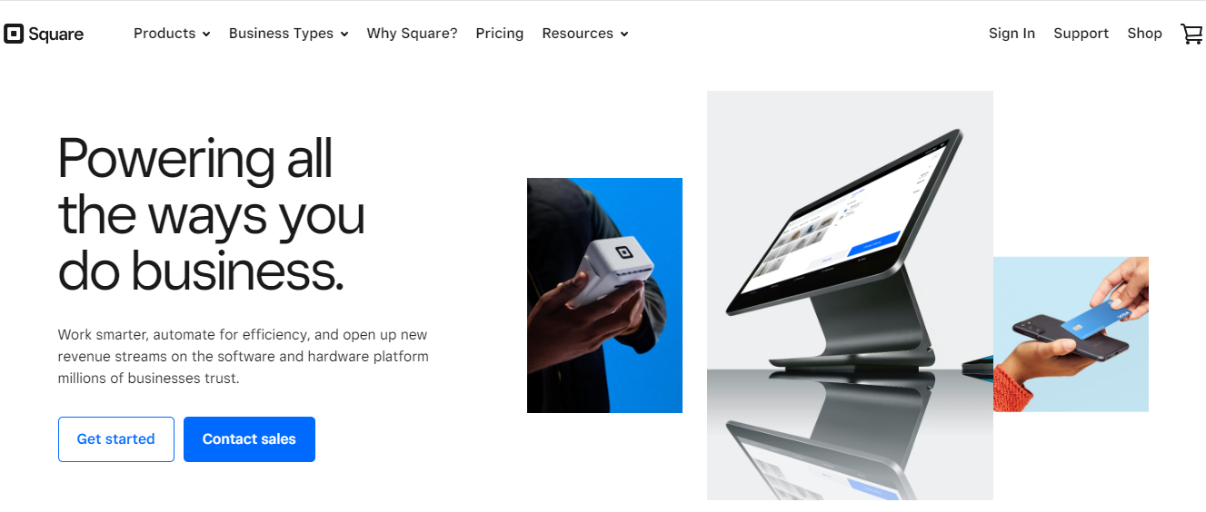
Square’s website stands out for its modern and sleek design. The use of vibrant colors, engaging animations, and a well-organized layout reflects the company’s commitment to innovation in the financial technology sector. The website effectively communicates complex information in a visually appealing manner.

We admire the exceptional website of Apex Transformations, skillfully showcasing its renovation and construction services. The meticulous attention to detail across the pages ensures a smooth browsing experience. The sparse configuration, coupled with well-crafted copy and occasional animations, contributes to the site’s overall elegance. Take the time to explore every page, as each unveils its distinctive and clever design elements, adding depth to the user experience.
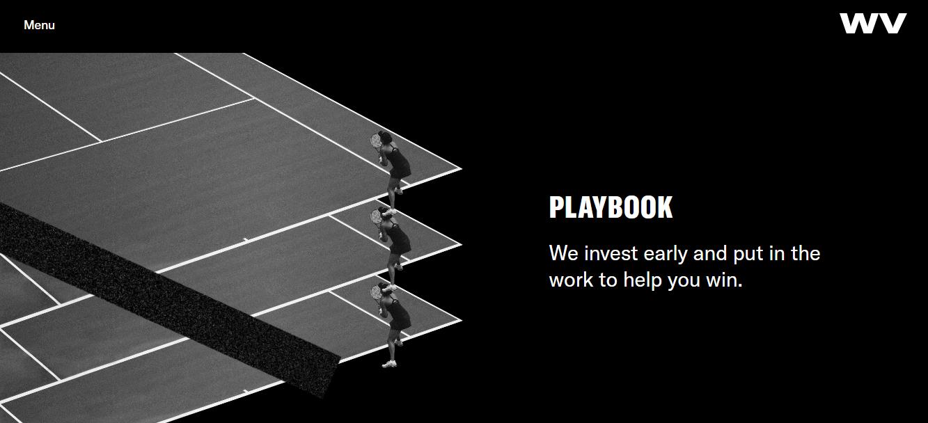
Our appreciation goes to Will Ventures, a venture capital firm founded by former NFL and Harvard athletes with a focus on funding sports, media, and consumer brands. This website goes beyond merely elucidating the company’s beliefs and mission; it actively encourages aspiring entrepreneurs to take the leap into the world of innovation and business.
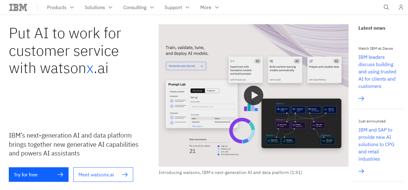
IBM’s website is a testament to the power of simplicity and effective information hierarchy. The strategic use of white space, concise messaging, and a clear navigation structure ensures that visitors can quickly understand the company’s offerings. The incorporation of infographics and case studies further reinforces IBM’s expertise.
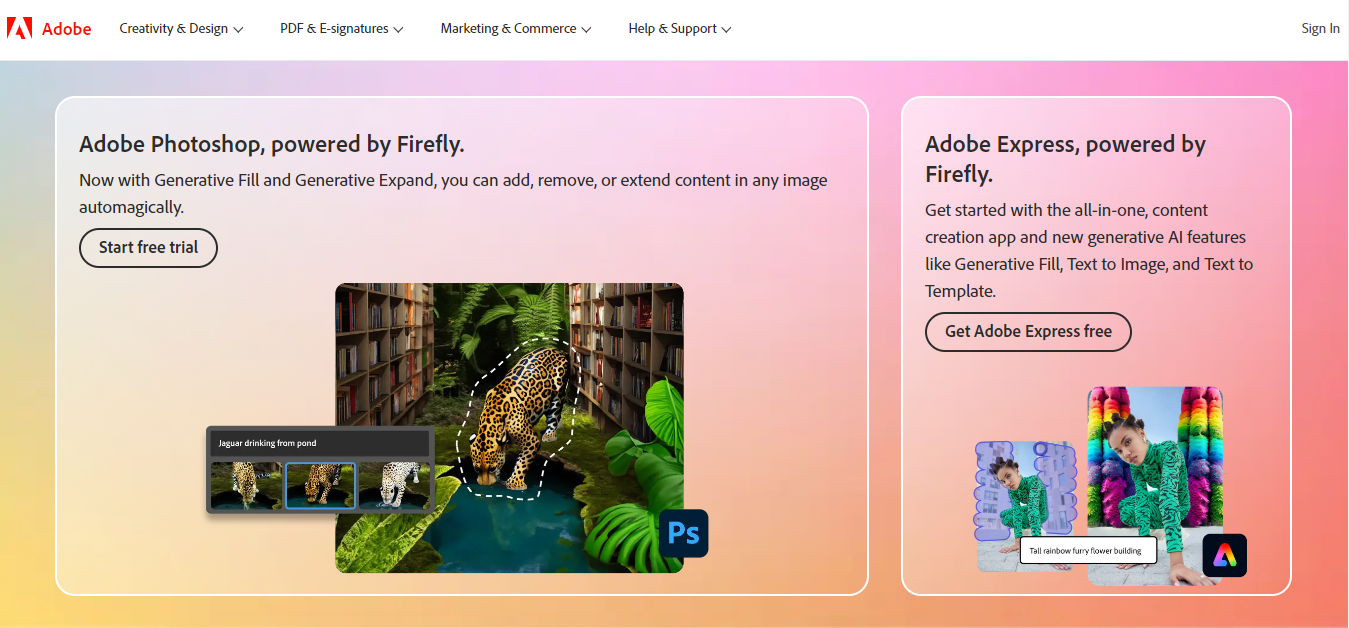
We appreciate Adobe’s sleek and informative website, a reflection of the brand’s consistency with its products and stellar reputation. Delve into the featured product pages for an immersive experience — each page is meticulously tailored to highlight specific products, whether it’s video software or a vector graphic editor. Despite the distinct flair of each page, the entire site seamlessly coalesces into a cohesive and unified online presence.
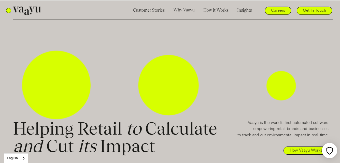
Our admiration extends to Vaayu, the pioneering software tool designed for real-time measurement of a business’s carbon footprint. As a groundbreaking idea, Vaayu’s website mirrors its uniqueness with an exceptional design. The user experience is not only delightful but consistently engaging, showcasing a remarkable balance even with minimal use of color. Take note of the captivating web texture in the background, adding an extra layer of visual appeal to the overall experience.
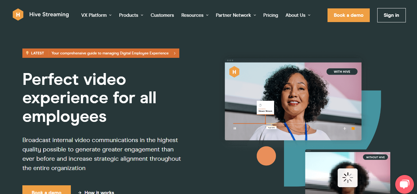
Our admiration goes to Hive Streaming, an internal video communication service boasting a top-tier B2B website. The content team excels in delivering precise information at optimal moments, ensuring continuous engagement with potential customers. Eschewing technical gimmicks, the website relies on a combination of great content and visually appealing design to make a lasting impression.
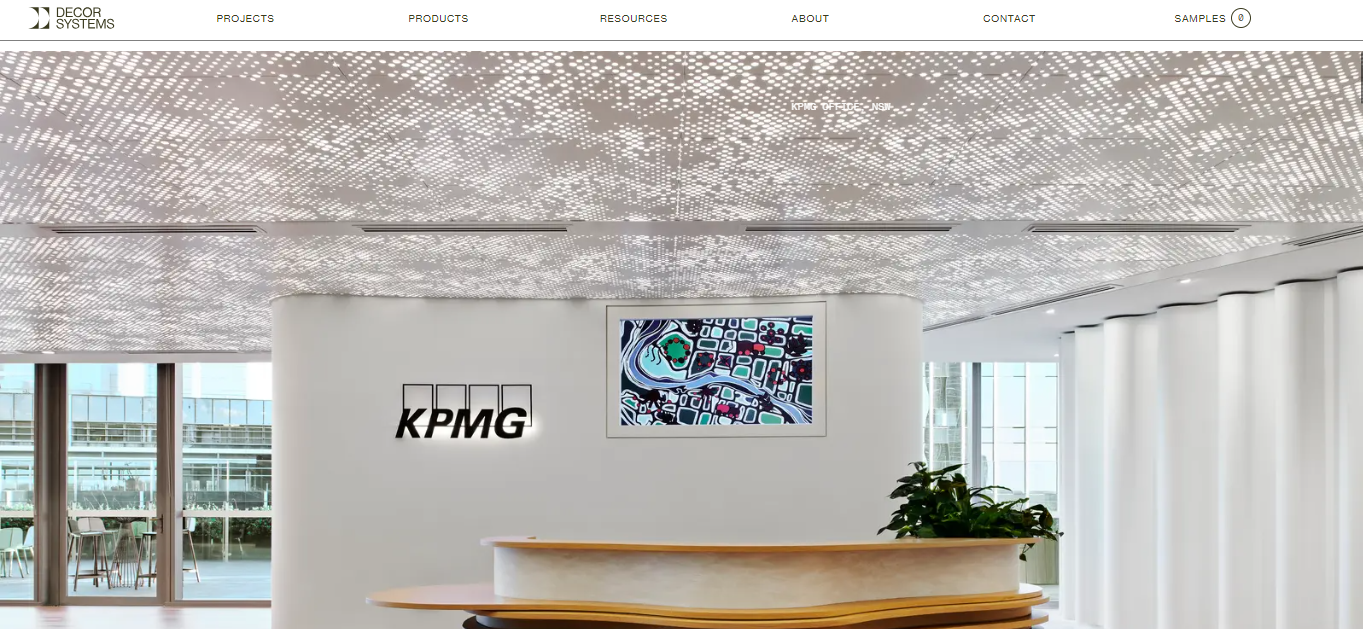
We appreciate the website crafted by the Australian architectural firm, Decor Systems, which seamlessly reflects its affinity for spaces blending organic and modern elements. The designers skillfully balance intentional use of space with detailed images introduced through on-scroll animations, creating a visit that is both calming and informative. Additionally, the site’s navigation serves as an excellent reference point, with menus making exceptional use of the fly-out technique.
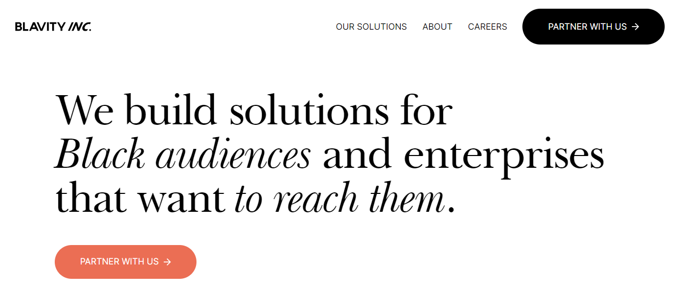
Our admiration extends to Blavity Inc., a network of brands catering to a Black millennial audience. Their website immediately captures attention with an exceptional full-screen video. The fast-paced introduction to the brand succinctly encapsulates everything within seconds, and the overlaid call-to-action eliminates the need to scroll to take action.
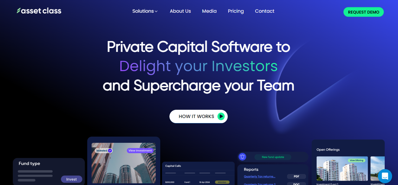
What stands out to us: Asset Class specializes in developing software for private equity, commercial lending, and venture capital firms, and the website’s uncomplicated design lends an approachable feel to this SaaS company. A highlight of this design is its uniform color scheme, seamlessly extending from CTA buttons to text to icons.
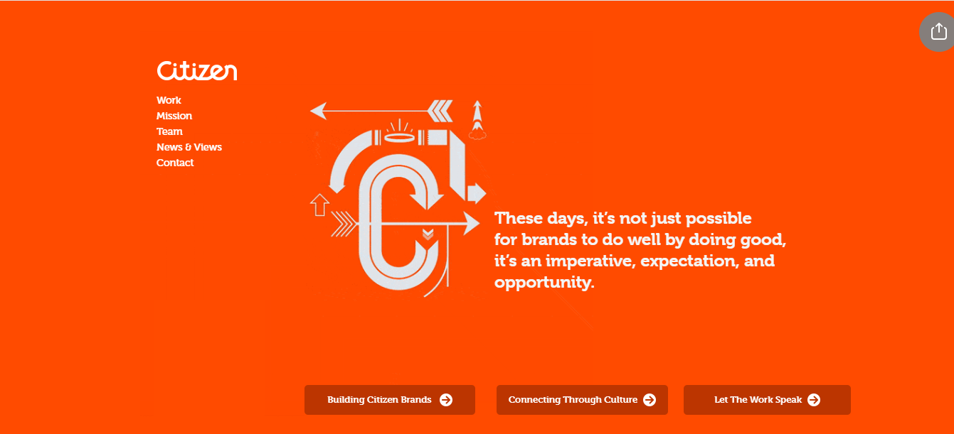
What impresses us: Citizen crafts impactful campaigns for both nonprofits and businesses. Despite its simple design, the website excels in organizing information and navigation. All relevant details about the agency are readily available and presented logically, with each case study following a format that is easy to follow.
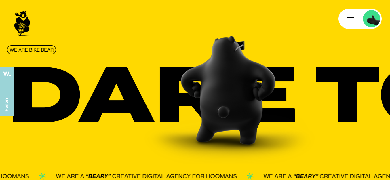
What captivates us: Bikebear boasts perhaps the most creatively designed homepage on our list. This team of marketers and web designers employs vibrant colors, distinctive fonts, playful copy, and, notably, animated bears sporting sunglasses. It serves as compelling evidence that being “corporate” doesn’t necessarily equate to being “bland.”
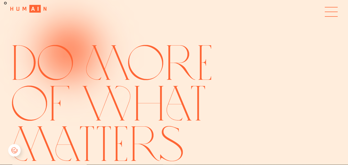
What captures our attention: The website of Humain incorporates visually striking cursor effects. As you move your mouse, hidden illustrations, text, and menu items are revealed, creating an enticing experience that encourages you to explore the entire homepage to discover intriguing bits of information you might otherwise overlook.

What stands out to us: MeanPug’s website is vibrant, engaging, and memorable. It features playful animations, copy that playfully refers to the company’s staff as “pugs,” and even an embedded game of Tetris that users can enjoy (or, if you’re like me, lose quickly).
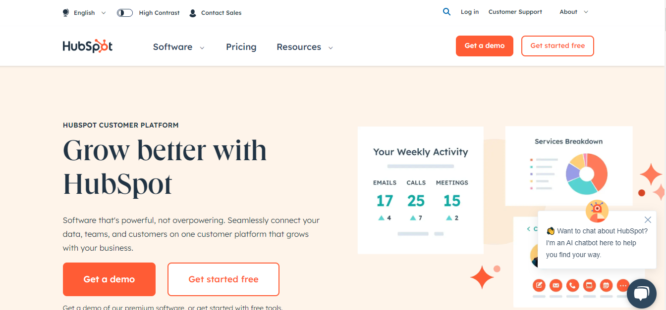
What impresses us: HubSpot’s website is designed to provide you with the information you need with minimal friction. Whether you’re interested in signing up for a demo, exploring products and pricing, reading the blog, or taking an inbound marketing course, the site is structured for seamless navigation.
Creating a corporate website that effectively communicates your brand identity is a crucial step in establishing a strong online presence. Here are key steps to ensure your website aligns with and reinforces your brand identity:
A company’s online presence is crucial, especially through its corporate website. This article provides you with the basics of corporate website design, drawing inspiration from successful examples and emphasizing key design principles. The guide also outlines steps to create a user-centric website that communicates brand identity.
ONEXT STUDIO– Company A stands out for its high-quality web design services. With an experienced team of experts, we are committed to delivering a website for your business that not only exudes professionalism but also leaves a strong impression on your customers. Let us assist you in building a robust and captivating online platform.
Topic started 2 years
Last Post 2 years ago