
June 17

Corporate identity design goes beyond just a logo or colors. It’s the complete picture you paint of your company, encompassing branding, visual elements, and communication style. The goal? Maximum visibility and instant recognition by your target audience.
While you might not have complete control over how your brand is perceived, crafting a strong corporate identity is crucial. Imagine launching a business without a logo – it can make building trust and attracting customers an uphill battle.
So, why is a distinctive identity essential? Because it shapes how people connect your company with specific values, experiences, and offerings. When your brand stands for something meaningful, it resonates with your audience and drives them to choose you. Even if your identity isn’t perfect yet, there’s always room for improvement. Start with a logo and color palette, and refining your branding becomes easier over time.
Simplicity often wins. A clear and concise visual identity allows customers to easily picture your company when they hear your name. However, complexity can also be powerful in the right hands. While it might take more effort to perfect, a well-executed intricate design can leave a lasting impression.
The bottom line? Every business needs a corporate identity. It can encompass your logo, website, stationery, signage – anything that visually represents your company. It’s the face you present to the world, so ensuring it accurately reflects your brand and values is critical.
Developing a unique identity can be a challenge, as striking the right balance is key. You don’t want to alienate your audience or employees, nor do you want to fall behind competitors. This guide will equip you with the essential steps to crafting a corporate identity design that sets you apart, from choosing the perfect typeface to creating a logo that stands out.
The foundation of your corporate identity design is your logo. It’s the visual signature that sets you apart and instantly conveys your brand essence. A well-crafted logo builds trust and recognition, acting as a powerful tool for establishing your presence in the market. Conversely, a weak logo can undermine your brand image, hindering your ability to connect with customers.
The key lies in creating a logo that seamlessly aligns with your brand values and message. Here are some important queries to think about:
Creating a truly effective logo goes beyond functionality. Here’s where your unique identity comes into play:
While some companies utilize multiple logos to maintain consistency across different applications, it’s important to strike a balance. An overwhelming number of logos can create confusion and detract from your brand message.
Your logo acts as the cornerstone of your brand’s identity, so it should visually communicate your company’s message in a clear and consistent way. Imagine a clothing brand known for its playful and youthful styles – their logo wouldn’t be a stern, black and white emblem. Instead, it might incorporate vibrant colors and a whimsical font to reflect their brand personality.
For maximum impact, keep your logo simple and uncluttered. Avoid using intricate symbols or overly detailed designs that might get lost when reproduced at smaller sizes. Think of logos like Nike’s swoosh or Apple’s bitten apple – instantly recognizable despite their simplicity.
Memorable logos are key to building brand recognition. When someone sees your logo, it should spark a connection and leave a lasting impression. Ideally, it should spark curiosity and encourage them to discover more about your brand.
To get started, brainstorm the elements that best represent your company’s values and strengths. Consider the following:
By carefully considering these elements, you can create a logo that serves as a powerful introduction to your brand and sets the stage for a successful corporate identity design.
Research is King: Just like any good plan, a successful logo starts with research. Dive into what your competitors are doing and what design trends are resonating with your target audience. Explore online resources to get a feel for the current visual landscape.
Know Your Audience: The secret is to know who your ideal client is. How do they interact with brands online? What are their values and interests? What kind of visual cues resonate with them?
Brand Focus: Your logo should be a clear reflection of your brand identity. What makes your company unique? What message do you want to convey? Keep this core focus at the forefront of your logo design.
Device-Friendly Design: In today’s digital world, your logo needs to adapt seamlessly across different platforms. Ensure it looks sharp and recognizable on mobile phones, tablets, and laptops. Consider how it will appear in both light and dark settings.
Alignment is Key: A well-balanced and aligned logo exudes professionalism. Pay close attention to the placement and arrangement of design elements for a polished look.
Originality Matters: Don’t fall into the trap of copying existing logos. Embrace your brand’s unique personality and avoid designs that could lead to copyright issues.
Target Audience Connection: Your logo should speak directly to your ideal customer. Consider what visuals would resonate with them and evoke positive brand associations.
By following these tips and keeping your brand identity at the core of the design process, you can create a logo that serves as a cornerstone for your corporate identity design.
In today’s fast-paced world, people crave quick and clear information. Lengthy messages get lost in the shuffle, leading to confusion and frustration. Imagine sending a marketing email and receiving replies like “What does this mean?” – a sign your message hasn’t landed.
The key to effective communication lies in a branding statement that’s both visually appealing and easy to grasp. People are drawn to things they understand at a glance.
Here are the key ingredients:
Think of your brand statement as a handshake – a brief introduction that leaves a lasting impression. Invest in professional design expertise for your logo to ensure a cohesive and impactful brand identity.
This revised section maintains the same structure and key points from the original, but uses simpler language and focuses on clarity and conciseness. It also emphasizes the visual aspect of the branding statement and the importance of a strong logo. The length is similar to the original, with two paragraphs that deliver a clear message.
Let’s ditch the idea of a definitive “best” list. Great corporate identity design is subjective and constantly evolving. However, this section explores some powerful examples that have resonated with audiences in recent years.
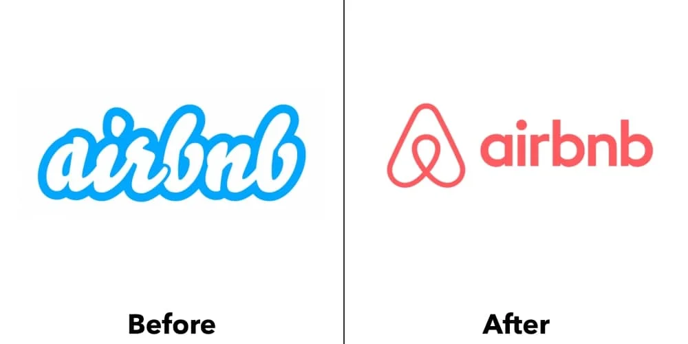
A few years back, Airbnb recognized the need for a brand refresh and enlisted the expertise of San Francisco’s DesignStudio. Initially, the rebranding sparked debate within and beyond design circles. Yet, as is often the case with logo redesigns, time has shown the wisdom of their choices. The shift from a trendy script logo to the now-iconic stylized “A” proved to be a success.
DesignStudio’s focus was capturing the essence of Airbnb: an international platform fostering connection, adventure, and a sense of belonging. This translated into a simplified logo, an icon rather than words, eliminating language barriers and achieving universal recognition. Additionally, a vibrant color palette and diverse photographic styles allow various cultures to connect with the Airbnb brand on a personal level.

The Swedish music giant, Spotify, has become synonymous with personalized music streaming. But their logo went through an evolution. Originally, it featured a unique font with a raised “O” and what seemed like radio waves.
In 2013, Spotify revamped their design, keeping the core “circle with radio waves” concept. They maintained the green and white color scheme but added a gradient for a touch of depth. Finally, in 2015, a branding consultancy refined the logo further, creating a truly impressive design.
One of Spotify’s branding strengths is its vibrant color palette. While green takes center stage, it’s not the sole player. They also leverage techniques like duotones, gradients, and pop art graphics. These elements help create a cohesive brand identity that reflects the diverse range of music they offer.
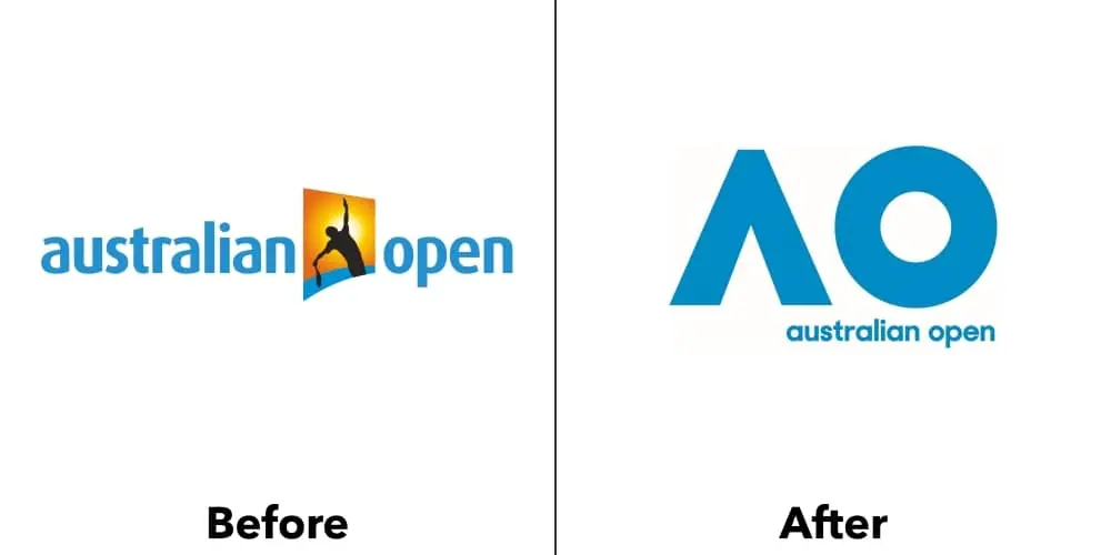
The Australian Open exemplifies a successful corporate identity refresh. In 2016, Landor Australia took a dated logo and completely transformed its visual language. They opted for a clean and modern approach, removing any imagery directly referencing tennis players or equipment. This simplification resulted in a streamlined design featuring just “AO,” with a unique twist – the crossbar of the “A” cleverly removed. This distinctive motif, a combination of a circle and delta shapes, was then applied consistently across all branding materials. The final result? A bold, energetic, and playful identity that perfectly reflects the spirit of the tournament, a stark contrast to the previous logo’s more formal and cluttered look.
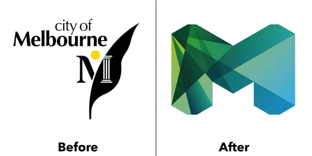
Following the Australian Open’s success story, let’s look at Melbourne’s impressive rebranding in 2009. Previously, the city’s logo was a textbook example of generic city iconography: a sun, a Roman column, and some greenery. It conveyed authority, but lacked any spark. To add to the challenge, each department and event had its own distinct logo, creating a fragmented brand image.
This all changed in 2009. The city embarked on a comprehensive rebranding effort, introducing a brand new logo and a unified visual identity system. It’s worth noting the difficulty of such a project, especially for a large government organization known for its resistance to change. So, a big shout-out to both the designers and the city officials for pulling it off!
The new design is simply phenomenal, breathing new life into Melbourne’s corporate identity. Firstly, the logo now reflects the city’s dynamic and diverse culture, making it far more engaging for visitors. Secondly, it eliminates the clutter of previous logos, fostering brand consistency. Finally, it establishes a visual language that can be seamlessly applied across all city communications. The thoughtful details, like the logo’s ability to be deconstructed into individual shapes, further enhance its versatility.
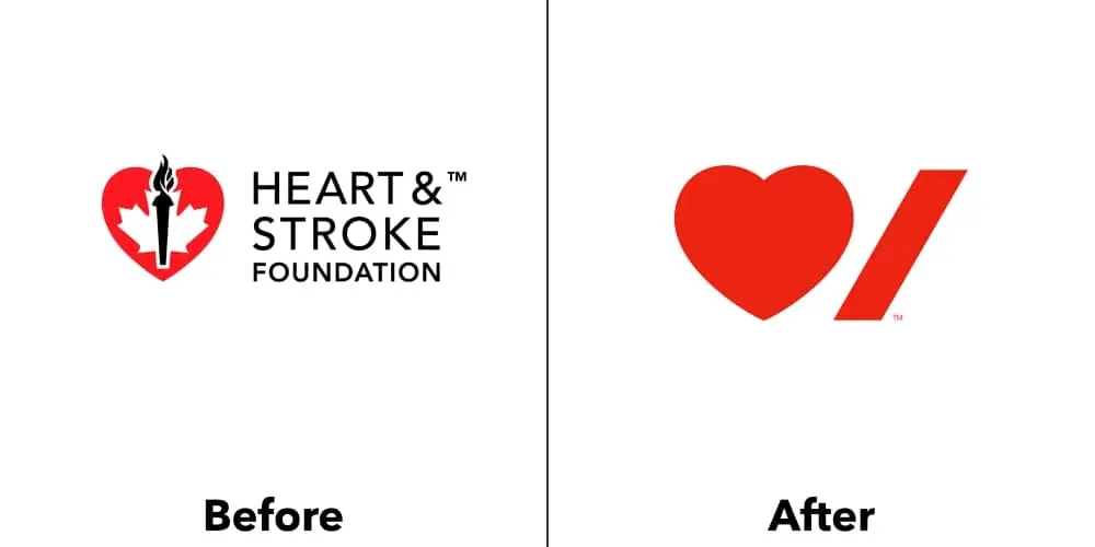
The Heart & Stroke Foundation’s logo redesign stands as a prime example of the power of simplicity in corporate identity design. Taking the original, complex logo, the design team led by Paula Scher of Pentagram, stripped it down to its core message. What truly impresses is the masterful use of negative space. The stroke, cleverly positioned beneath the heart’s curve, feels integrated and essential. The tightly spaced typography further reinforces this sense of unity. This streamlined design boasts remarkable flexibility. By removing the name and replacing it with specific locations or departments, the logo transforms seamlessly, showcasing its adaptability and lasting impact.
Kodak, the name synonymous with capturing memories through film, has faced a unique challenge in the digital age. However, they’ve shown remarkable resilience. Their recent brand refresh reflects a return to their heritage. While they had previously streamlined their logo to a simple wordmark in 2006, they’ve reintroduced the iconic red “K” block. This time, it features a modern sans-serif typeface with the brand name stacked neatly within it. The packaging design echoes this approach, utilizing bold simplicity to make their products stand out on shelves.
The path to success starts with a strong foundation. Your brand identity is the cornerstone of your marketing efforts. At ONextStudio, we offer web design and branding services that work in perfect harmony. Our team will create a website that flawlessly reflects your brand identity, ensuring a seamless customer experience. Let’s build a brand that not only looks good but drives results. Contact us today.