June 30

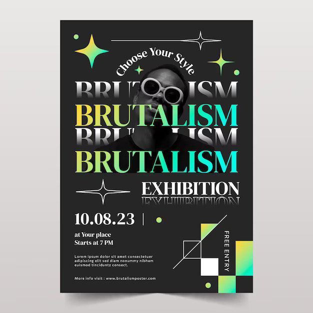
Is graphic design all about smooth curves and calming color palettes? Sure, those elements can create beautiful experiences. But what if you crave something more? Something that punches through the noise with raw power and unapologetic honesty? Enter Brutalist Graphic Design: a movement that celebrates the exposed concrete and bold functionality. Forget the velvet ropes and polished perfection; Brutalist design embraces the raw, the industrial, and the unconventional. It’s a visual language that cuts through the clutter, demanding attention and leaving a lasting impression. Buckle up, because we’re about to delve into the world of Brutalist Graphic Design and unveil its potential to revolutionize the way we communicate visually.
Brutalist graphic design isn’t just a theoretical concept. It’s a powerful tool that designers are using to create impactful campaigns and brand experiences. Let’s explore some real-world examples to see how the principles we discussed translate into action:
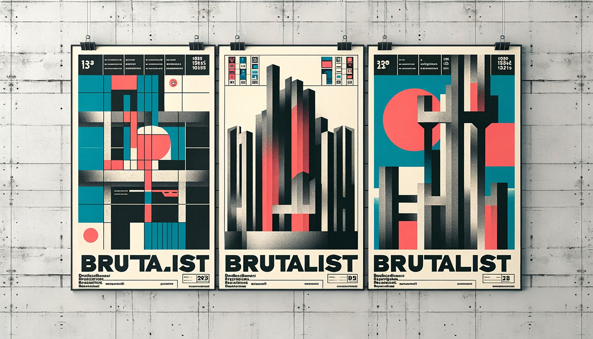
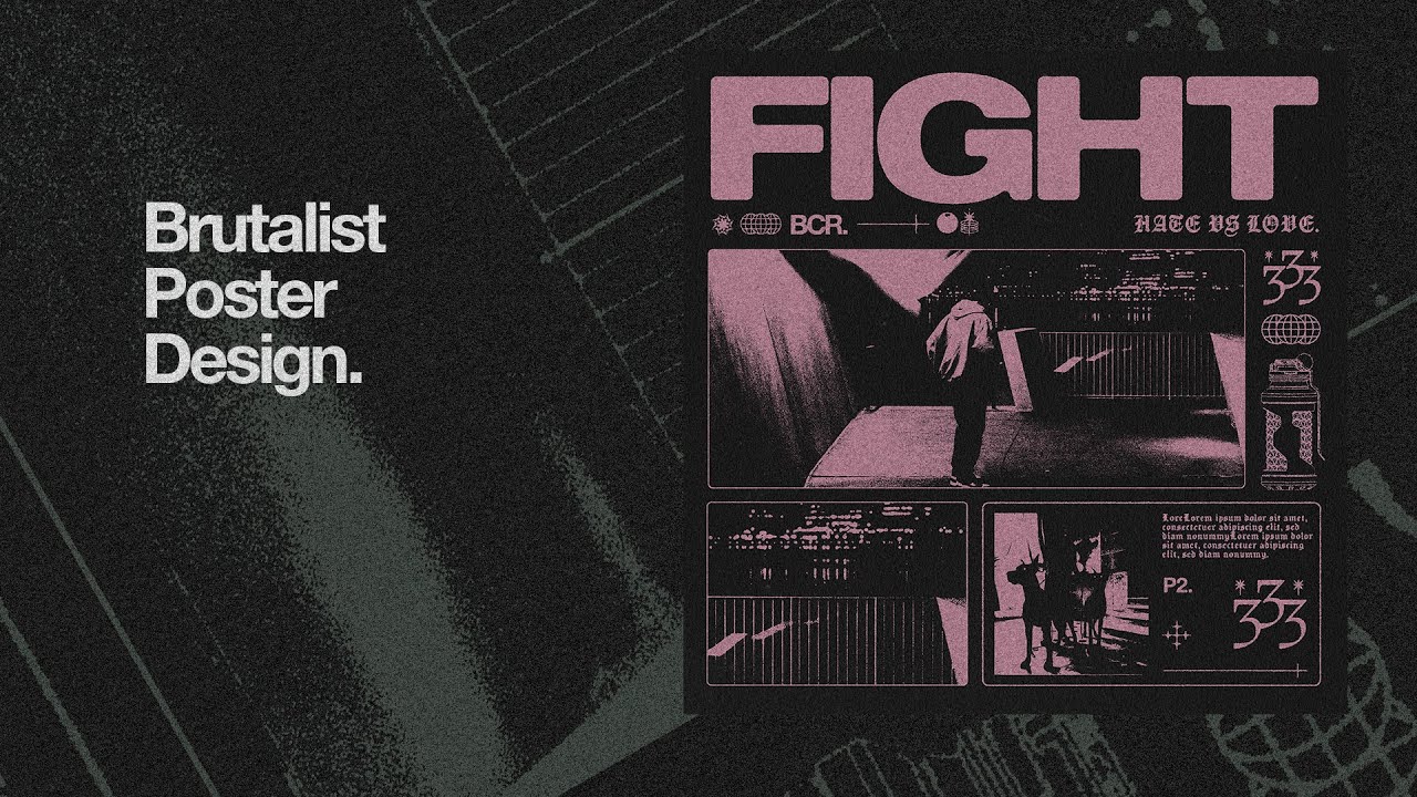
Imagine a poster for an underground music festival. The design might feature a bold, geometric typeface announcing the event name, layered over a grainy black and white photo of a mosh pit. Raw concrete textures could be incorporated as a background element, and pops of red might accentuate key details like dates and locations. This Brutalist approach conveys the raw energy and underground nature of the event, perfectly targeting its intended audience.
Brutalist design can be a powerful tool for social commentary. A campaign raising awareness about urban renewal might utilize a collage of Brutalist architecture juxtaposed with images of displaced communities. The typography could be purposefully harsh and confrontational, urging viewers to engage with the issue. This approach creates a sense of urgency and compels viewers to take action.
A fashion magazine focusing on avant-garde styles could embrace Brutalist design for a bold cover. Imagine a close-up image of a model adorned with industrial-inspired jewelry, set against a backdrop of geometric shapes. The magazine title might be displayed in a chunky, all-caps typeface, demanding attention and reflecting the edgy content within.
A musician known for their raw and emotional music could utilize Brutalist design for their album cover. This could involve a textured, industrial background with the artist’s name displayed in a bold, distressed font. The overall aesthetic would reflect the intensity of the music and create a sense of intrigue for listeners.
These are just a few examples, and the possibilities with Brutalist graphic design are vast. By analyzing successful applications, we gain a deeper understanding of how this movement can be used effectively to create impactful visual communication.
Brutalist graphic design isn’t for everyone. It’s a bold statement, a visual middle finger to the predictable and the bland. But for those seeking to make a lasting impression, it’s a potent weapon. If you’re a brand ready to shed the velvet ropes and embrace raw authenticity, Brutalist design can be your armor.
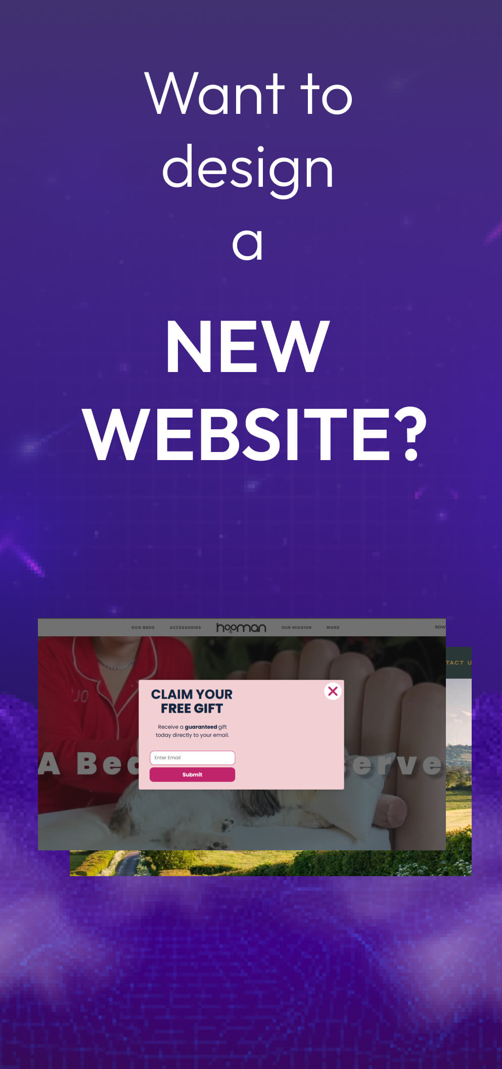
ONextStudio’s web design and branding expertise can help you craft a Brutalist masterpiece that cuts through the noise and leaves your audience speechless. We’ll translate the movement’s core principles – functionality, raw materials, and a rejection of unnecessary embellishment – into a website experience that resonates with your target audience. Imagine a website that’s not just informative, but a powerful statement of your brand’s strength and unapologetic spirit. That’s the power of Brutalist design, and that’s the experience ONextStudio can help you create. Let’s ditch the tired aesthetics and build a visual identity that truly reflects your brand’s unique voice. Contact us today.