June 30

Brutalism in graphic design stands out from the crowd. It thrives for creative and unconventional brands, but this rule-breaking approach requires careful handling.
While trends in graphic design tend to ebb and flow, brutalism isn’t simply out of favor. It’s more about whether it aligns with the overall style and message a brand wants to convey.
That’s precisely what makes brutalism so captivating. In a sea of designs adhering to similar aesthetics year after year, a brutalist website that defies convention can easily grab attention.
The key lies in determining if that attention is the kind your brand desires. Brutalist design can sometimes come across as cold or serious. Without proper execution or when paired with the wrong brand, it might send unintended signals to visitors.
This guide dives deep into brutalism in graphic design. We’ll explore its core principles, how it differentiates itself from minimalism and anti-design movements, showcase examples of brutalist websites, and provide insights on when it’s the right choice for your brand.
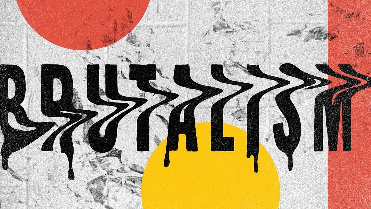
Brutalism in graphic design embraces a straightforward and unpretentious style, prioritizing clear communication over embellishment and effectiveness over visual appeal. This approach results in a raw aesthetic that’s extremely stripped-down and minimalistic.
Brutalism has its roots in 1950s architecture. The term itself comes from the French word “brut,” meaning “raw.”
A great example of how brutalist architecture prioritizes function over form is the Barbican Centre in London. This massive structure features exposed concrete and a striking, utilitarian design.
While brutalist graphic design won’t have the same imposing presence as a building, it shares a similar construction philosophy, relying on the “raw materials” of graphic design. This translates to a focus on core elements like text and layout, with minimal embellishments.
Here are some key characteristics of brutalist graphic design:
Although these traits are common, brutalist design can be interpreted in various ways. Modern designers might incorporate brutalist elements into their work while still using some contemporary design techniques. For instance, a poster might have a clear layout with bold typography and limited colors, but still include a high-quality photograph.
Brutalism’s roots trace back to Europe in the 1950s, a time of post-war reconstruction. Faced with limited resources, designers embraced a pared-down aesthetic. Think exposed concrete, bold brick, and simple color schemes. While not known for beauty contests, these raw materials facilitated faster, more affordable construction.
The United Kingdom, considered the birthplace of brutalism, adopted it for practical reasons. It offered a cost-effective way to build essential structures like housing, schools, and government buildings. The Soviet Union also embraced brutalism after WWII, not just for its practicality in tackling housing shortages but also as a rejection of ornate, bourgeois styles.
By the 1970s, brutalism’s popularity waned. While the low-cost materials allowed for rapid rebuilding, the imposing, stark forms gained a negative reputation for being cold, harsh, and even linked to Communism.
However, brutalism didn’t vanish entirely. Early websites, those built in the internet’s infancy, often showcased a brutalist aesthetic. Even today, some 1990s websites retain this style. Craigslist, founded in 1995, is a prime example.
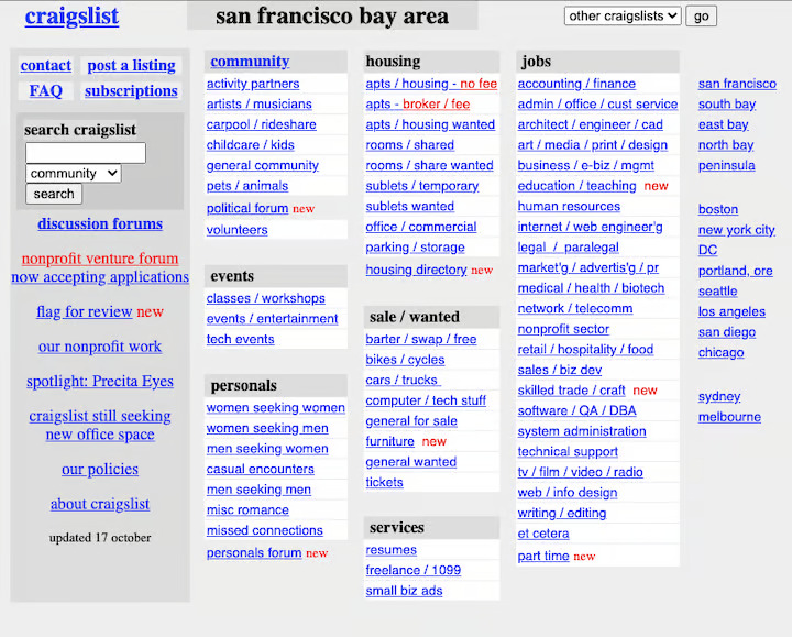
Notice the lack of imagery – just rows upon rows of blue links on a white background. Here’s Craigslist today:
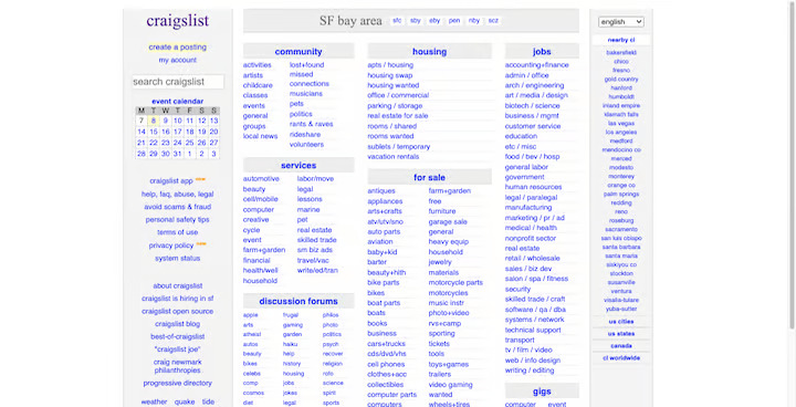
While the current design feels more polished, the core structure and unadorned approach remain. Craigslist forgoes the images and white space typical of modern websites, opting for clear headers and blue hyperlinks to build its main pages.
Brutalism offers a distinct direction for graphic designers. It’s crucial, however, to distinguish it from antidesign, a 1960s movement in both Italian architecture and web design known for its jarring, cluttered, and disorienting interfaces. Brutalism’s core purpose was to strip design back to its basics for practicality, not to create intentionally ugly experiences like antidesign.
While both brutalism and minimalism might seem like polar opposites at first glance, they share a core principle: prioritizing clear function over excessive decoration. Every element on the page should serve a specific purpose.
Brutalism takes this concept to the extreme. Imagine a website stripped down to its bare bones – raw functionality reigns supreme. Think exposed concrete walls in website design (think brutalist architecture!).
Minimalism, however, aims for a more balanced approach. Sure, simplicity is key, but aesthetics still matter. Minimalist designers carefully consider details like spacing, hierarchy, and color palettes to create a clean yet visually appealing experience. Forget the default website builder look – minimalism is all about intentional design choices.
Brutalism often throws aesthetics out the window. The focus is on using available resources to get the message across effectively. It’s a “content-first” mentality on steroids.
Minimalist designers, on the other hand, are more strategic. While content remains king, they utilize various user interface components and even subtle animations to guide users towards important information.
Here’s another key difference: practicality. Minimalism has staying power because it offers a timeless approach. Users appreciate clean, attractive, and easy-to-use interfaces. Brutalism, however, can be a fleeting trend. Its raw, unpolished style might not resonate with everyone, and it often lacks versatility across different design projects. Think of it as a niche style best suited for bold, avant-garde projects.
Brutalism isn’t afraid to break away from traditional graphic design rules. But that doesn’t mean brutalist designs are unusable – they simply follow a different set of principles:
Brutalism prioritizes efficiency. It focuses on using only the essential elements to create an impactful design. This often means working with unadorned layouts and default settings for fonts, colors, and shapes.
Content should be streamlined and focused on the core message. Eliminate clutter and features that might distract or slow down the experience.
While a brutalist design might appear basic at first glance, it can still convey a powerful sense of stability and structure. Even without overwhelming typography, the exposed framework of the design – like grids, lines, and clear navigation – can create a feeling of solidity.
Simple color palettes featuring black, white, and earthy tones like beige and brown evoke a sense of groundedness, similar to the raw concrete structures that inspire brutalism. The intentional use of rough textures and hard edges can further contribute to a more industrial aesthetic.
A stripped-down interface may not be traditionally “attractive,” but for users seeking a fast and efficient way to interact with a design, that might not be a concern.
However, brutalism doesn’t have to be synonymous with ugliness. Many contemporary brutalist works, including architecture, furniture, and graphic design, demonstrate how intricate design can be achieved without being wasteful or excessive.
Brutalism originally emerged as a practical and efficient approach to building. It also served as a challenge to the artificiality and embellishments that dominated the architectural landscape.
Today, brutalism in graphic design goes beyond just conveying strength. Its raw and unpretentious aesthetic can also communicate certain truths about a brand that might not be effectively expressed through words alone. Brutalism allows brands to present their authentic selves in a way that might not be possible with more conventional design approaches.
Brutalism can be a bold and innovative approach to graphic design, but it requires careful consideration. Here’s a breakdown of the pros and cons to help you decide if it’s the right fit for your project:
Stand Out From the Crowd: A brutalist design will be unique and distinct, making your brand stand out from competitors. This is ideal for creative businesses seeking to leave a lasting impression on clients.
Focus on Functionality: Brutalism prioritizes effectiveness over aesthetics. With a strong understanding of design principles and user behavior, you can create clear, distraction-free designs that deliver results.
Cost-Effectiveness: Brutalism is resource-efficient. If your client needs a high-performing design without excessive embellishments, brutalism can deliver significant value.
Faster Load Times: Brutalism often relies on basic HTML with minimal imagery. This translates to faster loading times, enhancing user experience and potentially improving SEO.
While brutalism offers unique advantages, it’s not without drawbacks to consider:
Limited Visual Appeal: Brutalism prioritizes function over aesthetics. While this can be effective, overly stark designs might alienate users according to the Aesthetic-Usability Effect, which suggests attractive interfaces are often easier to use.
Negative Perceptions: Brutalism can evoke negative connotations. Cold, industrial, and even post-apocalyptic are some terms associated with the style. Be mindful of how “raw” your design gets, as these associations might rub off on your brand.
Trend-Driven: Unlike minimalism’s timeless appeal, brutalism is more trend-based. Websites built with this style might require frequent updates as user engagement and conversions decline over time.
Readability Concerns: Brutalism’s focus on raw presentation can lead to readability issues, especially for lengthy content. Finding a balance between brutalist principles and elements like spacing and hierarchy is crucial for a user-friendly experience.
Intrigued by brutalism but unsure if it fits your brand? ONextStudio can help! Our Web Design and Branding services can guide you through the decision-making process, ensuring your visual identity aligns with your goals. Don’t be afraid to break the mold – let’s create something truly unique together. Contact us today.