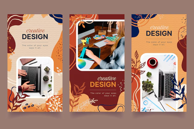

Logo Design
Creative Interior Design Logos: How to Make Your Brand Stand Out?
Topic started 2 years
Last Post 2 years ago
October 25


App icons are the first thing that users see when they browse the app stores or look at their home screens. They are the visual representation of your app and its functionality. They can also influence the user’s decision to download, use, or delete your app. Therefore, creating a stunning app icon is crucial for the success of your app. In this article, we will share 10 tips to help you create stunning app icons in 2024.
Different platforms have different guidelines and specifications for app icons. For example, iOS app icons have rounded corners, while Android app icons have adaptive shapes. You should follow the platform’s guidelines to ensure that your app icon is displayed correctly and consistently. You should also consider your target audience and their choices. For example, if your app is for children, you might want to use bright colors and cute characters. If your app is for professionals, you might want to use sleek and minimalist designs. Knowing your platform and audience will help you create an app icon that suits your app and your users.
App icons are small and have limited space. Therefore, you should avoid cluttering your app icon with too many details or text. Instead, you should focus on the main element or feature that represents your app and its function. You should also use simple and recognizable shapes and symbols that convey your app’s meaning without additional explanation. For example, a camera app icon might use a camera lens or a shutter symbol. A music app icon might use a musical note or a headphone symbol. Keeping your app icon simple and clear will help you create an app icon that is easy to understand and remember.
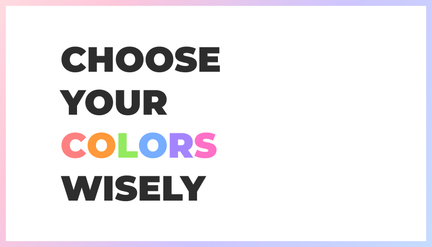
Colors can have a powerful impact on the user’s emotions and perceptions. They can also help your app icon stand out from the crowd or blend in with the theme. Therefore, you should use colors wisely when creating your app icon. You should choose colors that match your app’s brand identity and the platform’s guidelines. You should also use colors that contrast well with each other and with the setting. For example, you might want to use complementary colors or monochromatic colors for your app icon. You should also avoid using too much colors or colors that are too bright or dull. Using colors wisely will help you create an app icon that is attractive and appealing.
Effects and shadows can add some depth and realism to your app icon. They can also develop a sense of movement and interaction. Therefore, you might want to add some effects and shadows to your app icon. However, you should be careful not to overdo it or make it look too fake. You should use effects and shadows that are subtle and consistent with the light source and the perspective. For example, you might want to use a gradient or a glow effect to create some highlights or shadows. You might also want to use a drop shadow or a 3D effect to create some dimension or depth. Adding some effects and shadows will help you create an app icon that is dynamic and engaging.

Your app icon might look great on your computer screen, but it might not look the same on different devices and backgrounds. Therefore, you should test your app icon on different devices and backgrounds before launching it. You should check how your app icon looks on different screen sizes, resolutions, and orientations. You should also check how your app icon looks on different backgrounds, such as dark mode, light mode, or wallpaper. You should make sure that your app icon is visible and recognizable on any device and background. You should also make any adjustments or improvements based on the feedback and results. Testing your app icon on different devices and backgrounds will help you create an app icon that is compatible and adaptable.
App icon design is constantly evolving and changing. Therefore, you should follow the latest trends and best practices to create an app icon that is relevant and up-to-date. You should keep an eye on the app stores and the popular apps to see what kind of app icons are trending and successful. You should also read blogs, magazines, and books to learn about the latest app icon design tips and techniques. You should also look for inspiration and examples from other sources, such as Dribbble, Behance, or Awwwards. Following the latest trends and best practices will help you create an app icon that is modern and innovative.
While following the latest trends and best practices is important, you should also be creative and original when creating your app icon. You should not copy or imitate other app icons, as that might cause confusion or legal issues. Instead, you should try to create an app icon that is unique and distinctive. You should use your imagination and skills to create an app icon that reflects your app’s personality and style. You should also experiment with different ideas and concepts to create an app icon that surprises and delights your users. Being creative and original will help you create an app icon that is memorable and remarkable.

Creating an app icon can be a challenging and subjective process. Therefore, you should ask for feedback and opinions from others to improve your app icon. You should ask for feedback and opinions from your target audience, your peers, your clients, or your friends and family. You should ask them about their first impression, their understanding, their preference, and their suggestion for your app icon. You should also listen to their feedback and opinions with an open mind and a positive attitude. You should not take their feedback and opinions personally or defensively. Instead, you should use their feedback and opinions to make your app icon better and more user-friendly. Asking for feedback and opinions will help you create an app icon that is user-centric and validated.
Your app icon is not a one-time thing. It is a living and evolving thing. Therefore, you should update and optimize your app icon regularly to keep it fresh and relevant. You should update and optimize your app icon based on the user’s feedback, the app’s performance, the platform’s changes, or the market’s demands. You should also update and optimize your app icon based on your app’s updates, improvements, or expansions. You should not be afraid to make changes or improvements to your app icon, as long as they are beneficial and necessary. Updating and optimizing your app icon regularly will help you create an app icon that is current and competitive.
Creating an app icon can be a fun and enjoyable process. Therefore, you should have fun and enjoy the process of creating your app icon. You should not see it as a chore or a burden, but as an opportunity and a challenge. You should not stress or worry too much about your app icon, but rather enjoy the creative and expressive process. You should also celebrate and appreciate your app icon, as it is a reflection of your hard work and passion. Having fun and enjoying the process will help you create an app icon that is positive and energetic.
You have learned the 10 tips to create stunning app icons in 2024. Now you can apply these tips and skills to your own app project, or hire a professional app design service like ONextStudio to do it for you. ONextStudio is a leading app design company that can help you create app icons that are attractive, functional, and reliable. Contact us today and let us turn your app idea into reality.
Topic started 2 years
Last Post 2 years ago