
Creative Interior Design Logos: How to Make Your Brand Stand Out?
Topic started 1 month
Last Post 1 month ago
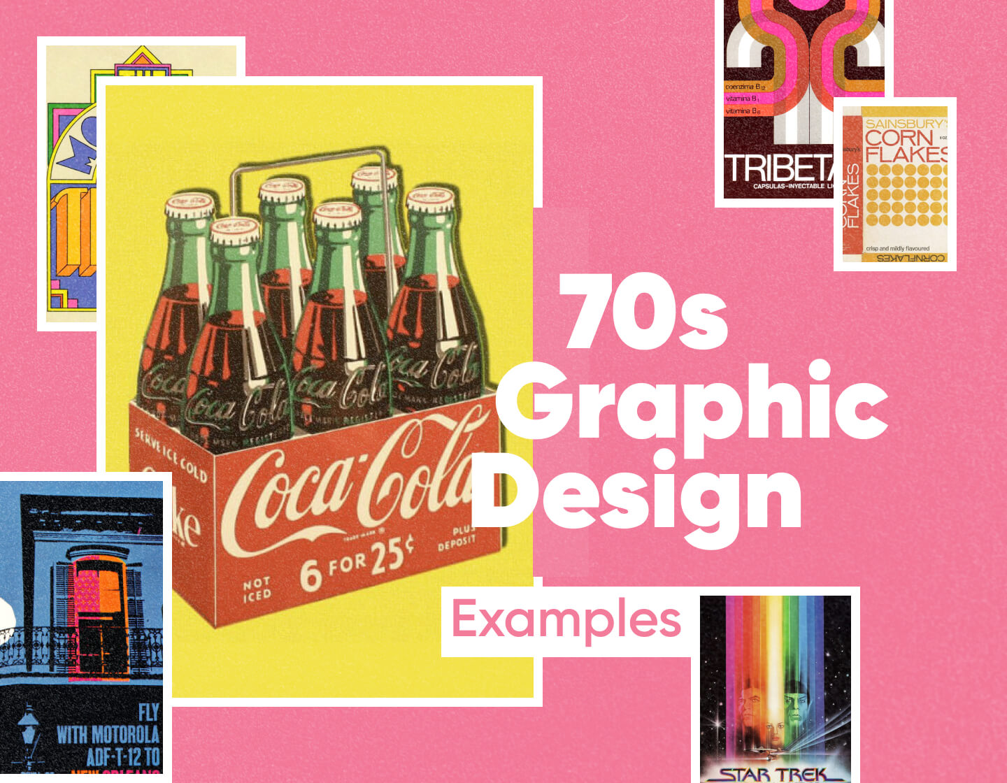
Calling all retro enthusiasts and design aficionados! Are you itching to add a splash of 70s flair to your next project? Look no further! We’re about to embark on a vibrant journey through the coolest examples of 70s graphic design. From the bold colors of Pop Art to the trippy swirls of Psychedelia, get ready to discover a treasure trove of inspiration that will ignite your creative spark and launch you headfirst into your next retro masterpiece!
Now that we’ve explored the major design movements of the 70s, let’s delve into the specific visual elements that made them so distinct and continue to inspire designers today. Buckle up, because we’re about to create a recipe for crafting your own slice of 70s design magic!
A Color Explosion: Forget about muted tones. The 70s were all about bold and often unexpected color palettes. Think about oranges, burnt reds, deep browns, sunny yellows, and pops of turquoise and avocado green. Imagine a sunset color scheme with a splash of electric blue thrown in for good measure. These colors were used not just for backgrounds but also for text, creating a vibrant and visually arresting effect.
Shapes that Groove: Move over, straight lines! The 70s embraced organic shapes that mirrored the free-flowing spirit of the decade. Think swirling patterns, paisleys with their intricate teardrop designs, and of course, flowers in all their glory. But don’t forget the geometric side of things either. Bold geometric shapes like circles, squares, and triangles often played a key role in creating a sense of structure and balance alongside the organic forms.
Funky Fonts: When it comes to typography, the 7s went big and bold. Imagine chunky, rounded fonts with thick strokes, sometimes nicknamed “bubble letters.” There was also a love for hand-drawn typography with a psychedelic twist, incorporating wavy lines and distorted lettering. Sans-serif fonts played a role as well, but with a wider variety and more playful experimentation than the minimalist Swiss Style approach.
By mastering this unique combination of color, shape, and typography, you’ll be well on your way to recreating the unmistakable look and feel of 70s graphic design. Stay tuned, because in the next section, we’ll see how these elements come together in iconic examples from each design movement!
The 70s wasn’t just about leisure suits and disco balls; it was a vibrant decade that exploded with creativity in graphic design. Here’s a closer look at seven distinct styles that continue to inspire designers today:
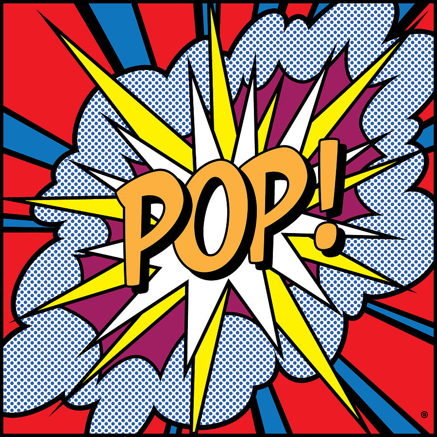
Imagine everyday objects like soup cans transformed into pop icons. This movement, spearheaded by Andy Warhol, challenged the definition of art. Think of bold, contrasting colors (reds, yellows, blues) plastered across canvases or used for impactful typography. Peter Max added another dimension with his playful, bold outlines and bursts of color, capturing the optimism and energy of the time.
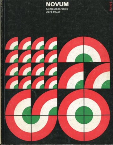
A stark contrast to the vibrancy of Pop Art, Swiss Style emerged from Europe, emphasizing order and precision. Think of clean lines, grid-based layouts, and a focus on clear communication. Sans-serif fonts like Helvetica and Univers became staples, and color palettes were often restricted to black, white, and primary colors. This minimalist approach, exemplified by the iconic IBM logo, ensured designs were easily understood and remain timeless.
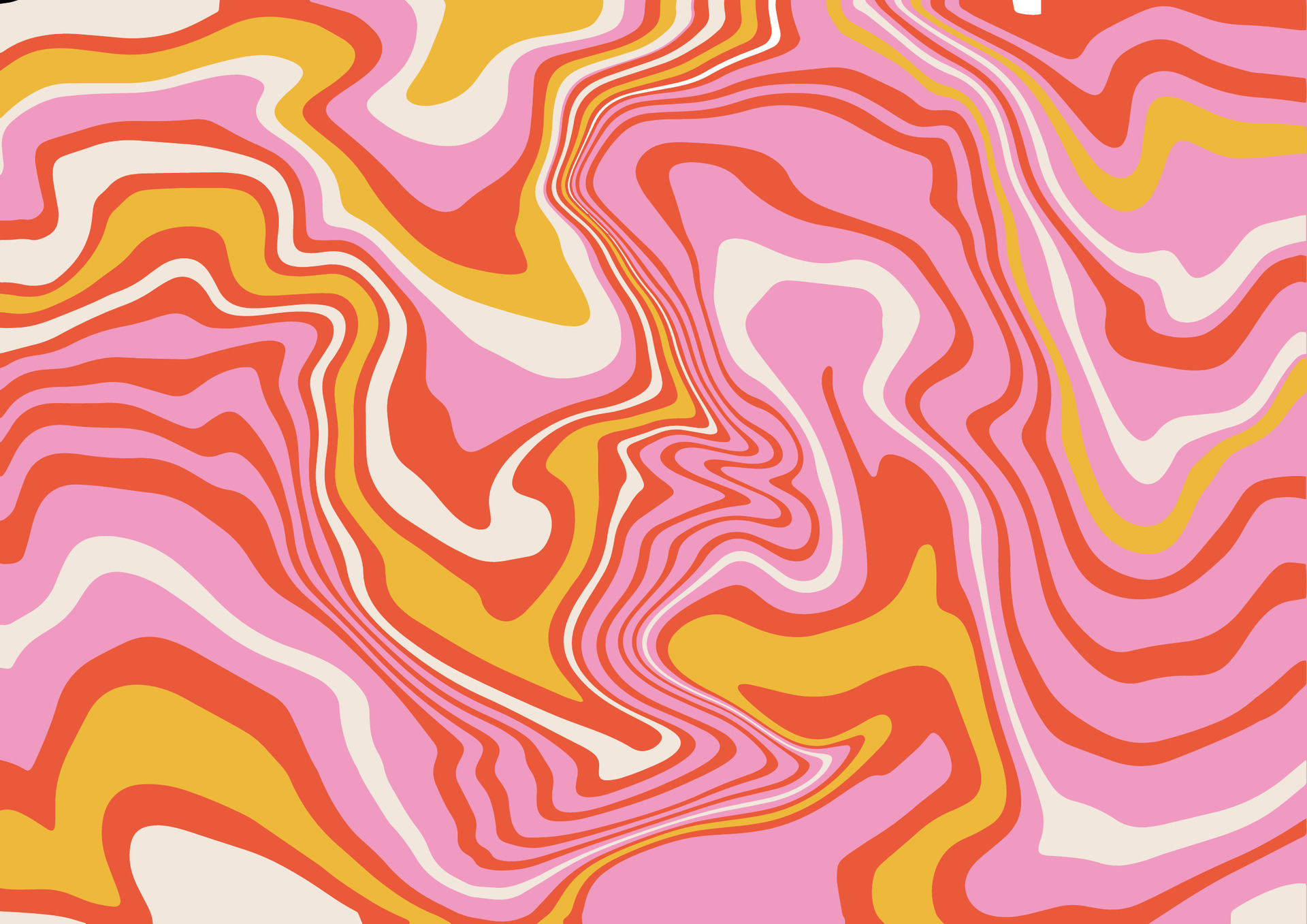
Fuelled by the counterculture and psychedelic rock, this style aimed to evoke a mind-bending experience. Imagine concert posters for bands like The Grateful Dead, featuring swirling organic shapes in neon hues, often accompanied by distorted text that appears to warp and pulsate. The focus wasn’t just aesthetics; it aimed to reflect the rebellious spirit of the times.
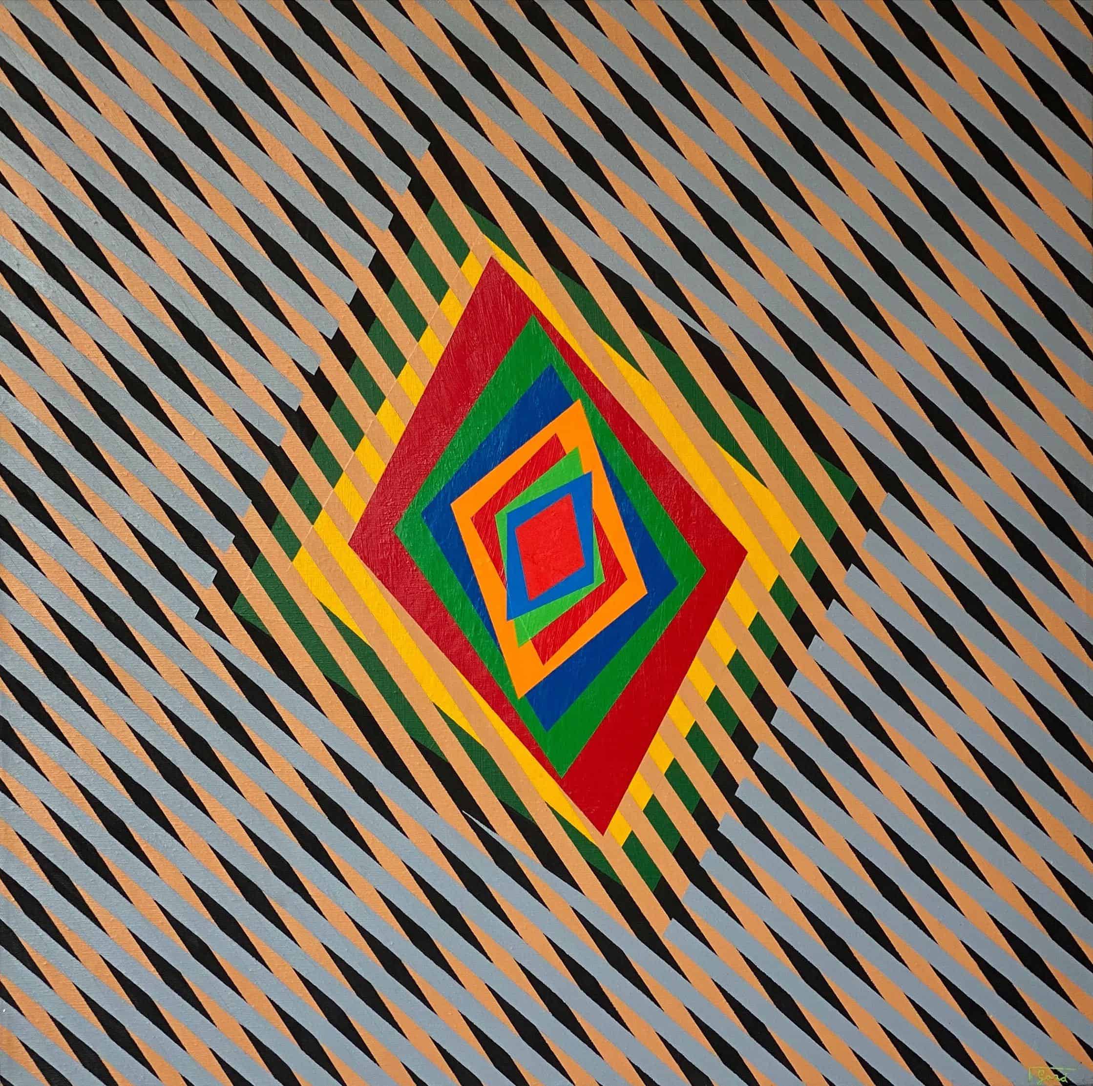
Challenge the viewer’s perception with this style that uses geometric shapes, patterns, and contrasting colors to create optical illusions. Think of artists like Victor Vasarely and Bridget Riley, whose work explores how our eyes interpret visual information. Imagine black and white squares arranged in a way that makes them appear to vibrate or hypnotic spirals that seem to move.
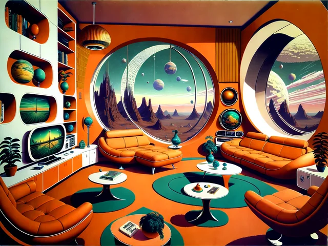
A utopian vision of the future, this style embraced sleekness and technological advancements. Imagine chrome-like elements, geometric shapes like circles and triangles, and imagery depicting futuristic cities or space exploration. This optimistic outlook is reflected in designs that often have a metallic sheen and a sense of movement.
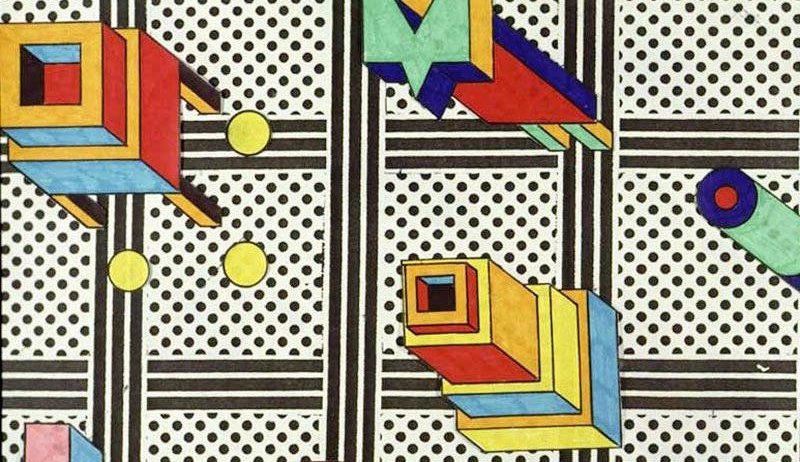
This movement, founded in the late 70s, challenged traditional design with its playful rebellion. Think of bold, clashing colors (think pink and orange) used fearlessly alongside geometric shapes like squiggly lines and squashed circles. This style wasn’t afraid to be quirky and unexpected, often incorporating playful patterns and a sense of humor.
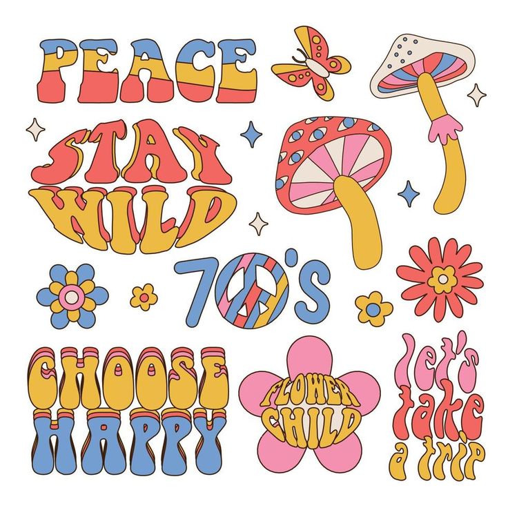
Embrace the imperfections of hand-drawn art! This style, often used in illustrations and album covers, celebrated organic forms and imperfect lines created with pen, ink, and markers. The emphasis was on authenticity and individuality, with artists expressing themselves freely through their loose, expressive lines and textured elements.
Ditch the design doldrums and get your freak on with 70s-inspired graphics! Don’t be a square, let ONextStudio’s web design and branding wizards transport you back to a time of platform shoes and bell bottoms. We’ll craft a website that’s as unforgettable as a disco ball, with bold colors, funky fonts, and a layout that grooves to its own beat. Get ready to tap into the power of nostalgia and make your brand the center of attention. Let ONextStudio help you create a digital space that’s as timeless as a classic record – with all the modern functionality to keep you ahead of the curve. Contact us today.