Creative Interior Design Logos: How to Make Your Brand Stand Out?
Topic started 1 week
Last Post 1 week ago
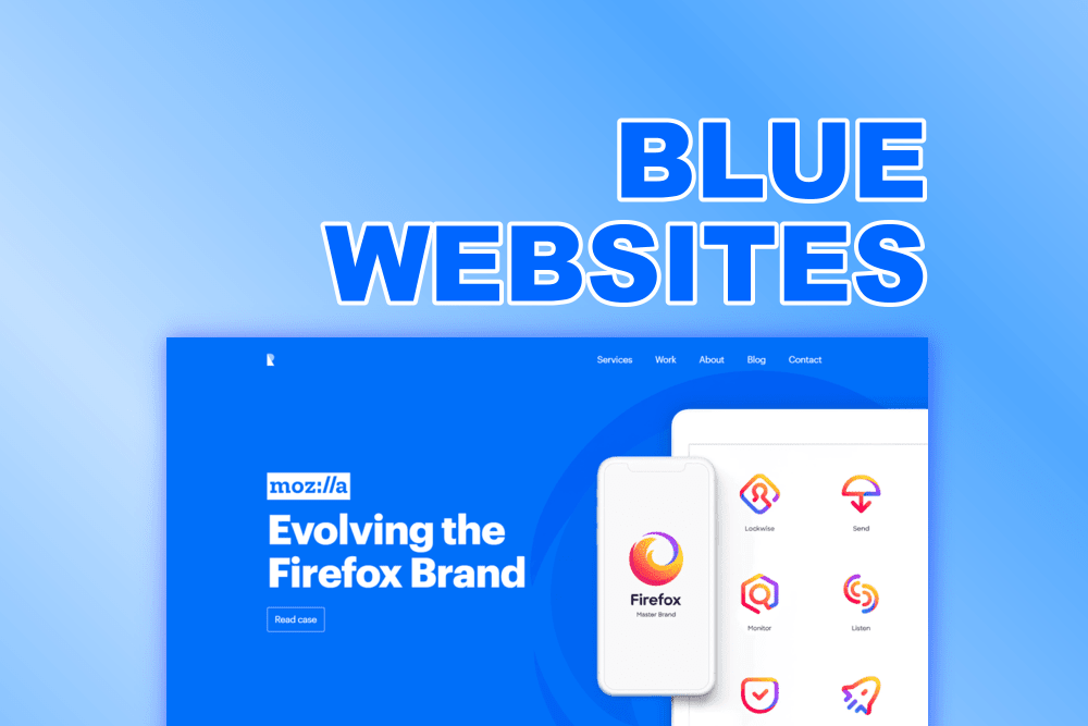
Blue is a versatile and popular color for website design. It can evoke various emotions and associations, such as calmness, trust, professionalism, and creativity. Blue can also create a striking contrast with other colors, such as white, yellow, or orange. In this article, we will show you seven examples of blue websites that use this color in different ways and for different purposes. These websites are:
Let’s take a look at these blue websites and see what makes them so appealing and effective.
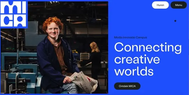
MICA is a leading institution of art and design in the United States. Their website uses a dark blue background and a light blue accent color to create a sophisticated and artistic look. The website also uses white and gray elements to create a balanced and clean look. It features a large and attractive hero section that showcases their programs and value proposition. Furthermore, it also uses smooth animations and transitions that enhance the user experience and engagement. Additionally, it has a clear and concise copy that explains their mission and vision. The website also has a simple and elegant navigation that allows visitors to easily access their admissions, academics, student life, and alumni information. MICA’s website is a perfect example of how to use blue to create a sophisticated and artistic website design that reflects your brand identity and style.
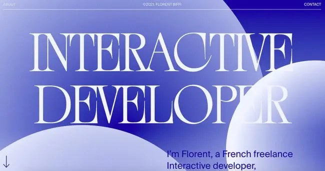
Florent Biffi is a creative web developer and content creator. His website uses a light blue background and a dark blue accent color to create a fresh and modern look. The website also uses yellow and orange elements to create a warm and inviting feel. It features a catchy and persuasive hero section that showcases his work and value proposition. The website also uses neat animations and illustrations that show the features and benefits of his services. Florent Biffi’s website is a perfect example of how to use blue to create a fresh and modern website design that showcases your work and value proposition.
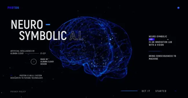
PHOTON is a platform that provides various solutions for web performance, such as CDN, storage, video, and image optimization. Their website uses a gradient of blue colors to create a dynamic and futuristic look. It also uses white and gray elements to create a balanced and clean look. Moreover, it features a stunning and interactive hero section that showcases their solutions and benefits. The website also uses impressive animations and graphics that demonstrate the speed and performance of their platform. Furthermore, it has a clear and compelling copy that explains their solutions and features. The website also has a prominent and smart call-to-action button that invites visitors to start a free trial. PHOTON’s website is a perfect example of how to use blue to create a dynamic and futuristic website design that showcases your solutions and benefits.
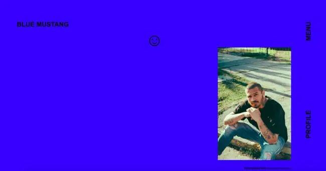
Carlos E. Molina Tovar is a web design teacher and a former Awwwards jury member. His website uses a dark blue background and a light blue accent color to create a professional and elegant look. The website also uses pink and purple elements to create a playful and creative feel. The website features a bold and catchy hero section that showcases his work and value proposition. Moreover, it also uses subtle animations and transitions that enhance the user experience and engagement. The website has a minimal and direct copy that communicates his vision and mission. Carlos E. Molina Tovar’s website is a perfect example of how to use blue to create a professional and elegant website design that reflects your brand personality and style.
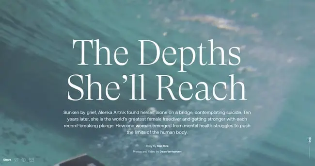
The Depths She’ll Reach is a multimedia story by Long Lead that recounts how Alenka Artnik emerged from obscurity and mental health struggles to become one of the world’s most elite freedivers. Their website uses a light blue background and a dark blue accent color to create a cool and calm look. The website also uses green and yellow elements to create a contrast and interest. In addition, it features a captivating and immersive hero section that showcases their story and value proposition. The Depths She’ll Reach’s website is a perfect example of how to use blue to create a cool and calm website design that showcases your story and value proposition.
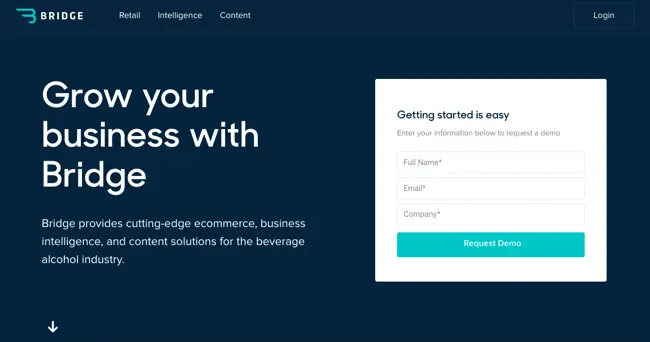
Bridge is a platform that allows bridge players to play online with other players or with robots. Their website uses a dark blue background and a light blue accent color to create a sporty and sleek look. The website also uses white and black elements to create a contrast and focus. Furthermore, it features a large and attractive hero section that showcases their platform and value proposition. The website also uses smooth animations and transitions that enhance the user experience and engagement. The website has a clear and persuasive copy that explains their platform and benefits. Bridge’s website is a perfect example of how to use blue to create a sporty and sleek website design that showcases your platform and value proposition.
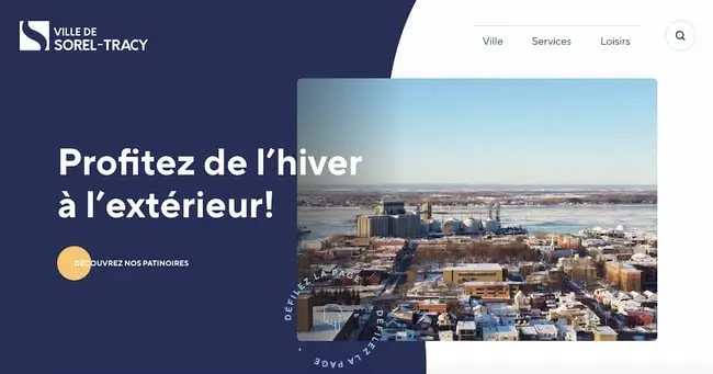
Sorel City is a fictional city that is featured in a video game called Sorel. Their website uses a light blue background and a dark blue accent color to create a futuristic and urban look. The website also uses red and orange elements to create a dynamic and exciting feel. Furthermore, it features a large and eye-catching hero section that showcases their city and value proposition. The website also uses impressive animations and graphics that show the city and the gameplay. The website has a clear and compelling copy that explains their city and features. Sorel City’s website is a perfect example of how to use blue to create a futuristic and urban website design that showcases your city and value proposition.
In this article, we’ve shown you seven examples of blue websites that embrace this color and create amazing designs for 2024. These websites are inspiring and effective, and you can learn from them to create your own blue website. However, if you need any help or guidance, you can always rely on ONextStudio, a web design agency that offers a range of services such as web design, branding, and marketing design. Contact us today.