
Logo Design
Creative Interior Design Logos: How to Make Your Brand Stand Out?
Topic started 1 year
Last Post 1 year ago
October 25

Have you ever come across a website that made your eyes water, or a sign so confusing it left you muttering to yourself? That, my friends, is the unfortunate world of bad graphic design examples. But before we delve into the hilarity (and horror) of design fails, let’s rewind a bit.
Graphic design is all about using visual elements to communicate ideas. It’s the silent salesman on your website, the storyteller on your brochure, and the first impression your brand makes. When done well, it’s seamless, effective, and leaves a lasting impression. But when it goes wrong…well, that’s where the Cringe Hall of Fame comes in.
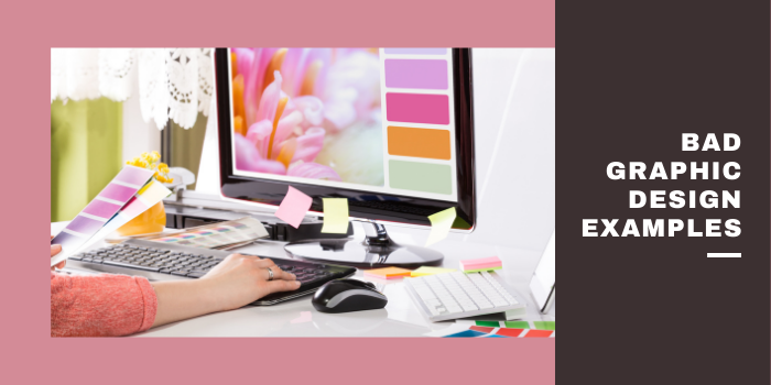
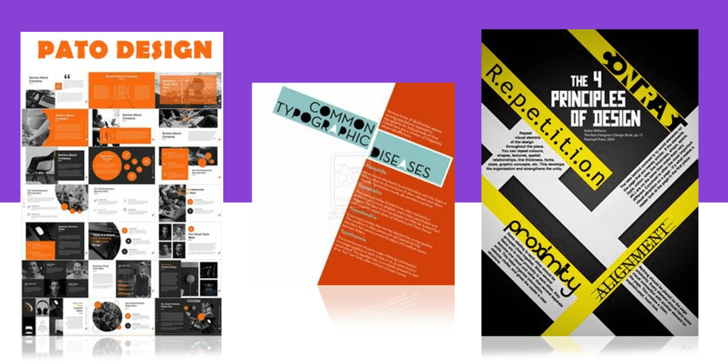
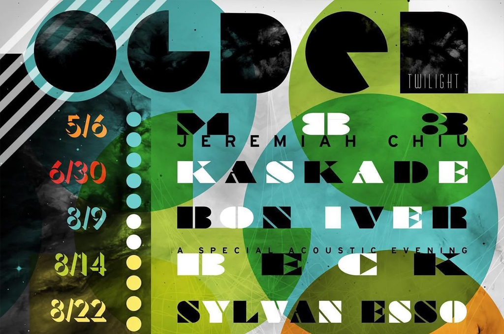
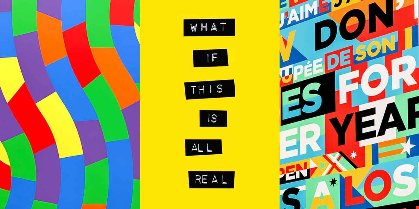
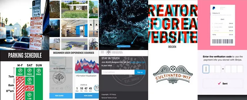
The world of graphic design is filled with stunning creations that capture attention, communicate ideas clearly, and leave a lasting impression. But unfortunately, it also has a dark side – a place where design choices go horribly wrong. Below are 15 bad graphic design examples that might evoke discomfort, yet they could serve as instructive lessons as well:
Imagine a playful logo for a children’s daycare center. Now, picture that same logo morphing into something entirely different and decidedly inappropriate when flipped upside down. This is the nightmare scenario of hidden messages in logos. A little forethought during the design process can prevent such PR disasters.
Have you ever spent an eternity hunting for the “Buy Now” button on a website? This frustration is caused by camouflaged calls to action. Buttons that blend seamlessly into the background with confusing colors or excessive ornamentation make it a chore for users to complete the desired action. Frustration leads to abandoned shopping carts and lost sales.
The Disappearing Menu: Websites should be intuitive and user-friendly, not mind-bending puzzles. Navigation menus that vanish like smoke and mirrors on hover are a prime example of bad design. This forces users to play a guessing game to find the information they need, ultimately leading them to hit the “back” button in exasperation.
We’ve all been there – standing in a foreign city, hopelessly lost because of a poorly designed sign. Imagine a tourist map with nonsensical arrows pointing in the wrong direction or a key with cryptic symbols that resemble ancient hieroglyphics. These signage fails leave people wandering aimlessly and frustrated.
Safety and clarity should be paramount in signage. Hiding crucial details like emergency exit locations or business hours in a font size only readable by a magnifying glass is not only inconsiderate but also a potential safety hazard. Effective signage should be clear, concise, and accessible to everyone.
Wrong Symbolism Stock photos can be a great resource for designers, but choosing the right ones is crucial. A dentist’s website featuring a stock photo of a shark attacking a swimmer is not exactly calming for patients seeking dental care. Similarly, a law firm using a photo of a judge laughing hysterically wouldn’t inspire much confidence. Make sure the stock photo complements your brand message.
Unrealistic Scenarios Stock photos can also go hilariously wrong when they depict awkward or nonsensical situations. Think of a businessman in a suit shaking hands with a disembodied arm floating mid-air. This kind of imagery creates an unprofessional and unintentionally humorous (in a bad way) impression.
The Illegible Invoice: Fancy fonts can add a touch of elegance, but if they come at the expense of readability, they defeat the purpose of design. Imagine receiving an invoice where the text resembles a ransom note, making it impossible to decipher the amount owed. Always prioritize clear communication over excessive ornamentation when choosing fonts.
Color is a powerful design tool, but using it poorly can have disastrous consequences. A children’s daycare website plastered in a jarring combination of blood red and neon green is an assault on the senses. Understanding color theory and considering accessibility for people with color blindness is key to creating a visually appealing and inclusive design.
In today’s high-resolution world, low-quality images are a major turn-off. A website featuring blurry, pixelated photos that look like they came from a 1990s flip phone screams amateur hour. Investing in high-resolution, relevant images makes a world of difference in creating a professional and visually appealing online presence.
Imagine a website where everything – text, images, buttons, and pop-ups – is crammed together like a clown car. Our brains crave order and clarity. A good layout uses hierarchy and white space to guide the viewer’s eye and make information easy to digest. Websites with overwhelming content blocks and cluttered layouts overwhelm users and make it difficult to find the information they need.
Design trends can be a source of inspiration, but sometimes, designers get carried away. Imagine a website that throws every trendy design element into the mix – excessive gradients, neon colors, busy patterns, and an animation that makes you dizzy. This “kitchen sink” approach creates a visually overwhelming and chaotic experience for users. Effective design focuses on creating a clear and cohesive visual experience, not replicating every fad that comes along.
Information hierarchy is crucial in design. The most important information should be the most prominent, with less critical details following suit. Imagine a website where the company logo takes up half the screen, while the contact information is hidden in a tiny font size at the bottom. This makes it difficult for users to find what they need quickly and efficiently.
Visual metaphors can be powerful tools for communication, but ensure they are clear and universally understood. Imagine a website for a financial advisor using an image of a tightrope walker to represent financial security. This metaphor might be confusing for some viewers and might not effectively convey the intended message.
While using all caps can add emphasis, overuse can be visually jarring and difficult to read. Imagine an entire website where every word is SHOUTING AT YOU IN ALL CAPS. This not only looks unprofessional but can also be perceived as aggressive. Use all caps sparingly and strategically for maximum impact.
By understanding these bad graphic design examples and their downfalls, you can make informed decisions when creating your own visuals. Remember, good design is about clear communication, user experience, and creating a lasting positive impression.
Here are some tips on how to avoid bad graphic design, building on the examples we discussed:
By following these tips and avoiding the pitfalls discussed in the bad design examples, you can create effective and visually appealing designs that communicate your message clearly and leave a lasting impression. Remember, good design is an investment that can benefit your brand, user experience, and ultimately your bottom line.
Conclusion
Remember, good design isn’t just about aesthetics; it’s about effective communication. Your visuals should tell a story, guide users, and ultimately, convert them into loyal customers. ONextStudio offers a comprehensive suite of design services, including Web Design, Branding, and Marketing Design. We’ll help you create a seamless visual experience across all your touchpoints, ensuring your message resonates loud and clear. Don’t settle for the cringeworthy – elevate your brand with ONextStudio! Contact us now.
Topic started 1 year
Last Post 1 year ago